Usability Testing: Evaluating User Experience and Ease of Use
Introduction to Usability Testing
Usability Testing is the process of evaluating a software application to ensure it is intuitive, easy to use, and user-friendly from an end-user’s perspective. While functional testing checks correctness, usability testing evaluates how comfortably and efficiently users can interact with the system.
Usability testing answers a practical question: can users easily and efficiently use the application?
Purpose of Usability Testing
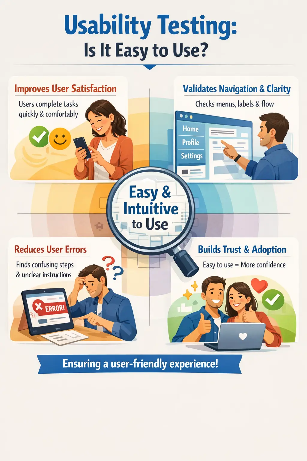
The primary objective of usability testing is to improve user satisfaction and reduce friction during interaction. A system may function correctly but still frustrate users if navigation is confusing, instructions are unclear, error messages are unhelpful, or tasks require unnecessary effort. Usability testing focuses on that practical user experience.
It helps reduce user errors by making workflows easier to understand. If users frequently choose the wrong option, miss required information, or abandon a task, the problem may not be user ability; it may be poor usability. Testing helps identify those friction points before they become production complaints.
Usability testing ensures intuitive navigation, validates clarity of content and messages, and ultimately increases user adoption and trust. Users are more likely to continue using a product when it feels clear, predictable, and respectful of their time.
The purpose is not only to make the application look pleasant. It is to make the application easier to use, easier to learn, easier to recover from mistakes, and easier to complete real tasks with confidence.
Core Usability Factors
Usability testing evaluates several key dimensions. Learnability measures how quickly new users can understand the system. Efficiency assesses how fast users can complete tasks once familiar with the interface. Memorability determines whether users can return after a break and still navigate easily. Error handling evaluates how clearly the system communicates mistakes and guides correction. User satisfaction reflects the overall comfort and confidence users feel while interacting with the application.
Learnability is important because users often decide quickly whether a product feels usable. If a new user cannot understand where to begin, what a button means, or how to complete a basic task, the product creates friction from the start. Good usability makes first-time use feel natural.
Efficiency matters after users understand the product. A workflow may be understandable but still too slow. Too many clicks, repeated data entry, unnecessary confirmations, or poorly placed actions reduce efficiency. Usability testing checks whether common tasks can be completed with reasonable effort.
Memorability matters when users return after a break. If users must relearn the system every time, the interface is not memorable. Consistent navigation, predictable labels, and familiar patterns improve memorability.
Error handling is a major usability factor. Users will make mistakes. The system should explain what went wrong, where it happened, and how to fix it. A clear error message can turn a mistake into a recoverable moment. A poor message can create frustration and support calls.
These factors collectively determine overall user experience quality. Usability testing evaluates them as part of real workflows rather than as isolated design opinions.
Role of the Manual Tester
The manual tester must think like a real end user rather than a technical reviewer. This involves evaluating whether navigation feels natural, whether instructions are clear, and whether workflows are logically structured.
Testers identify confusing steps, unnecessary complexity, inconsistent labeling, poor guidance, hidden actions, unclear messages, excessive clicks, and workflows that do not match user expectations. They observe not only whether a task can be completed, but how easily it can be completed.
A manual tester brings value by noticing human friction. For example, a tester may observe that a button is technically visible but placed far from the related content, that a label uses internal terminology, or that a form asks for the same information twice. These are not always functional defects, but they affect user experience.
When reporting usability issues, constructive suggestions for improvement add significant value. A good usability report explains the problem, describes the user impact, and when appropriate suggests a clearer label, shorter flow, better message, or more obvious placement. The tester should avoid vague statements such as "not user-friendly" and instead describe the specific friction.
Scope of Usability Testing
Usability testing typically covers navigation structure, menu organization, page layout, readability of content, clarity of error messages, effectiveness of help texts, and consistency across screens. It also evaluates whether forms are simple to complete and whether the number of steps required to finish tasks is reasonable.
It includes reviewing whether users can find important actions quickly, whether screen flow matches task flow, whether labels use language users understand, and whether the system gives feedback after actions. Feedback may include success messages, loading indicators, progress steps, validation messages, or confirmation screens.
Usability testing also evaluates content clarity. Long paragraphs, technical jargon, vague instructions, and inconsistent wording can all reduce usability. Users should not need to interpret internal system language to complete basic tasks.
The scope may include forms, search, checkout, registration, dashboards, reports, settings, navigation, help content, and error recovery. The goal is to remove friction and simplify interaction, especially in workflows users perform frequently or workflows that carry business value.
Usability Testing Compared to UI Testing
UI testing focuses on visual correctness and adherence to design specifications, such as alignment and formatting. Usability testing focuses on user experience and ease of use. A screen may look visually perfect but still be confusing or inefficient.
UI testing may confirm that a button is aligned, the font matches the design, and the color is correct. Usability testing asks whether users understand what the button does, whether it is placed where users expect it, and whether it helps them complete the task efficiently.
A screen may pass UI testing and fail usability testing. For example, a form may be visually neat, but if users do not understand which fields are required or why a validation message appears, the experience is poor. Usability testing prioritizes user satisfaction, while UI testing ensures visual consistency.
Both are important. UI testing protects visual accuracy and interaction correctness. Usability testing protects ease of use, clarity, and task success. Together, they create a product that looks right and feels right.
Real-Time Example
Consider an online checkout process. Usability testing evaluates whether the checkout steps are clearly defined, whether error messages explain what needs correction, and whether users are required to complete unnecessary steps. A lengthy or unclear checkout flow may lead to abandoned transactions even if the functionality works correctly.
A tester may check whether users can easily review cart items, understand shipping options, enter payment details, apply coupons, correct validation errors, and confirm the order. If the checkout hides important costs until the final step, users may lose trust. If error messages do not explain what is wrong, users may abandon the purchase.
The tester may also observe whether the number of steps is reasonable. A checkout flow that asks for the same address twice or forces unnecessary account creation may reduce conversion. The system may be functionally correct but commercially weak.
This demonstrates how usability directly impacts business outcomes. Better usability can reduce abandoned transactions, support tickets, training needs, and user frustration.
Entry and Exit Criteria
Usability testing begins after functional validation is complete and a stable user interface is available. It concludes when major usability concerns are addressed and user workflows are intuitive and efficient.
Entry criteria may include stable screens, defined user workflows, available design references, test user roles, realistic data, and agreement on target user groups. If the UI is still changing heavily, usability feedback may be useful but may not be final.
Exit criteria may include resolution of major workflow confusion, clear error messages, acceptable task completion flow, consistent terminology, and stakeholder review of known usability limitations. In some projects, actual user feedback may be required before exit.
The system should feel natural and easy to use before release. This does not mean every user will love every design decision, but common tasks should be understandable, efficient, and recoverable.
Common Usability Issues
Frequent usability defects include confusing navigation structures, unclear labels, poor error messaging, cluttered layouts, and excessive steps to complete tasks. These issues may not break functionality but can significantly reduce user satisfaction.
Confusing navigation is one of the most common issues. Users may not know where they are, how to return, or where to find a feature. Missing breadcrumbs, unclear menu names, and inconsistent navigation patterns can create frustration.
Unclear labels and internal terminology also reduce usability. If users do not understand what a field, button, or menu item means, they may hesitate or make mistakes. Labels should use language that matches the user's mental model, not only the system's internal design.
Poor error messaging is another major issue. Error messages should explain the problem and guide correction. A message like "Invalid input" is less helpful than a message explaining which field is invalid and what format is expected.
Cluttered layouts can overwhelm users. Too many actions, dense text, unclear grouping, and competing visual elements make it harder to focus. Usability testing checks whether the page helps users complete the task or distracts them.
Common Mistakes
One common mistake is assuming users think like testers or developers. Another is deprioritizing usability due to schedule pressure. Focusing exclusively on functionality while ignoring user experience can lead to technically correct but commercially unsuccessful software.
Another mistake is relying only on personal opinion. Usability observations should be connected to user impact, task completion, consistency, clarity, or known design principles. A tester should explain why a usability issue matters.
Teams also make the mistake of testing usability too late. If usability problems are found only near release, fixing them may require redesign, content changes, or workflow changes. Early feedback is cheaper and more useful.
Another mistake is ignoring different user types. A workflow that feels easy for an experienced admin may be confusing for a first-time customer. Usability testing should consider the audience.
Usability must be treated as a quality requirement, not an optional enhancement. If users cannot use the product comfortably, functional correctness alone is not enough.
Best Practices for Usability Testing
The first best practice is to test from the user's point of view. Testers should understand who the users are, what they are trying to accomplish, and what level of domain knowledge they have. A workflow should be judged against user needs, not only technical implementation.
The second best practice is to focus on real tasks. Usability testing should evaluate meaningful workflows such as registering, searching, buying, submitting, approving, downloading, or correcting an error. Testing isolated screens is useful, but real task flow reveals more friction.
The third best practice is to observe effort. Count unnecessary steps, repeated inputs, confusing decisions, unclear navigation, and points where the user may hesitate. Usability problems often appear as extra effort rather than hard failures.
The fourth best practice is to report issues constructively. A good usability report explains the issue, the user impact, and a possible improvement. For example, "The error message does not tell the user which field is wrong" is more useful than "Bad error message."
The fifth best practice is to test common and critical workflows first. Login, checkout, search, form submission, report generation, and account management often deserve high usability attention because users perform them frequently or because they affect business outcomes.
User Personas and Usability
User personas help testers evaluate usability from different perspectives. A first-time user may need more guidance than an expert user. A mobile user may need simpler navigation than a desktop user. An admin user may need efficiency for repeated tasks, while a customer may need clarity and reassurance.
Personas prevent testers from assuming that everyone uses the system the same way. They help reveal usability gaps caused by user experience level, device type, role, frequency of use, or business context.
For example, a complex dashboard may be acceptable for an expert analyst who uses it daily, but confusing for a manager who opens it once a month. Usability testing should consider these differences.
Usability Testing in Agile Projects
In Agile projects, usability testing should happen early and continuously. Testers can review wireframes, prototypes, and early builds before the feature is complete. Early feedback helps teams improve workflows before code becomes expensive to change.
Usability should also be discussed during backlog refinement. Acceptance criteria can include user-facing expectations such as clear error messages, reasonable number of steps, visible progress, and understandable labels. This makes usability part of the story, not an afterthought.
During sprint testing, testers can validate whether the implemented story feels usable, not just whether it works. If the feature technically passes but creates user confusion, the team should treat that as a quality concern.
Documentation and Evidence
Usability defects should be documented with context. The report should describe the workflow, the confusing step, the user impact, and any supporting screenshot or recording. Because usability can feel subjective, clear evidence helps the team discuss the issue constructively.
Useful evidence may include task steps, screenshots, screen recordings, time taken, repeated user mistakes, or comparison with expected design patterns. If real users are involved, their feedback can be summarized without exaggeration.
A good usability report helps the team improve the product. It should not only criticize the interface; it should explain the friction and support a better decision.
Usability Metrics and Observations
Usability testing can be supported by simple metrics and observations. Testers may note task completion success, time taken to complete a task, number of errors made, number of unnecessary steps, points of hesitation, and frequency of help usage. These observations make usability feedback more concrete.
Task completion is one of the most important indicators. If users cannot complete a workflow without help, the feature may need improvement even if it is technically functional. Time taken is also useful because a task that takes too long may discourage users from repeating it.
Error frequency shows where the interface misleads users. If several users make the same mistake, the issue is probably not user carelessness. It may indicate unclear labels, poor layout, missing guidance, or a workflow that does not match user expectations.
Satisfaction feedback can also help. Users may complete a task but still feel frustrated or unsure. Comments such as "I did not know what to do next" or "I was not sure whether it saved" are valuable because they reveal confidence problems.
Metrics do not replace tester judgment, but they make usability findings easier to explain. They help teams prioritize improvements based on evidence instead of opinion alone.
Interview Perspective
In interviews, usability testing is typically described as evaluating how easy and intuitive a system is for users. A strong explanation highlights that it ensures users can complete tasks efficiently and with minimal confusion, improving overall product quality.
A stronger interview answer explains that usability testing evaluates learnability, efficiency, memorability, error handling, and user satisfaction. It should mention navigation, labels, error messages, workflow simplicity, content clarity, and task completion.
If asked for an example, checkout is effective. The tester can explain checking whether users understand the steps, can correct errors, see total cost clearly, avoid unnecessary steps, and complete payment without confusion.
If asked how usability testing differs from UI testing, the answer should say that UI testing checks visual correctness and specification alignment, while usability testing checks ease of use and user experience.
Key Takeaway
Usability Testing ensures that software is not only functional but also intuitive, efficient, and satisfying to use. A well-designed user experience strengthens adoption, builds trust, and enhances long-term product success.
The practical value of usability testing is that it protects the user's ability to complete work with confidence. It reduces confusion, mistakes, training effort, support tickets, and abandonment.
Good usability testing combines user thinking, real task flows, clear observation, constructive reporting, and early feedback. It helps teams build software that people can actually use, not just software that technically works.