User Interface (UI) Testing: Ensuring Visual Accuracy and Usability
Introduction to UI Testing
User Interface (UI) Testing is the process of verifying that the visual elements and interactive components of an application function correctly and provide a consistent, intuitive user experience. It focuses on how the application looks and behaves from the user’s perspective. UI testing answers a simple but important question: is the application easy to use and visually correct?
While functional testing checks what the system does, UI testing checks how users interact with it.
Purpose of UI Testing
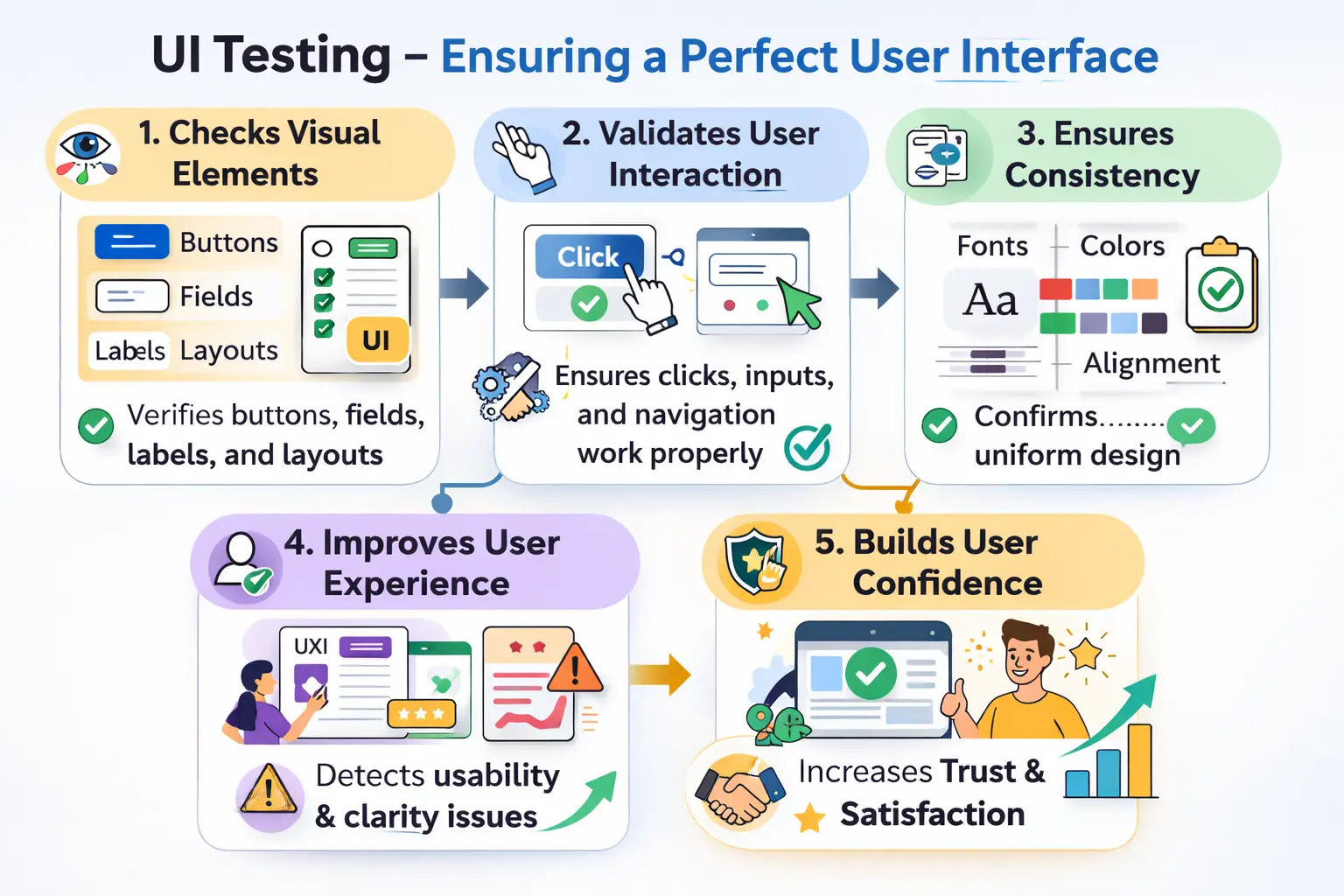
The purpose of UI testing is to ensure that all visual components are displayed correctly and behave as expected. A user does not experience an application as code, database tables, services, or internal logic. The user experiences screens, forms, buttons, links, menus, messages, colors, spacing, and interactions. UI testing validates that this visible layer is accurate, consistent, and usable.
It validates that user interactions such as clicks, inputs, selections, scrolling, tabbing, and navigation work smoothly. A button should look clickable and respond when clicked. A text field should accept input in the expected way. A dropdown should open, show correct options, and allow selection. A link should take the user to the correct destination. These interactions may seem small individually, but together they define whether the application feels reliable.
UI testing also helps detect layout inconsistencies, alignment issues, color problems, font mismatches, icon errors, spacing defects, and design mismatches. A system can be functionally correct but still feel unprofessional if the interface is visually broken. Users often judge product quality through the interface before they understand the deeper functionality.
A well-tested UI improves usability, builds user confidence, and strengthens overall product perception. When the interface is clean, predictable, readable, and consistent, users are more likely to trust the application. When the UI is inconsistent or confusing, users may doubt the product even if the backend logic is correct.
Scope of UI Testing
UI testing covers a wide range of visual and interactive elements. This includes validating buttons, links, input fields, labels, layouts, spacing, fonts, colors, icons, menus, headers, footers, cards, tables, modals, tooltips, alerts, notifications, and messages displayed to the user. It ensures that design guidelines are followed and that the interface remains consistent across screens.
It also includes checking state changes. A button may have normal, hover, active, disabled, loading, and error states. A form field may have empty, focused, filled, invalid, valid, and disabled states. A menu may be expanded or collapsed. UI testing verifies that these states appear correctly and support the user journey.
UI testing includes verifying that visual elements behave correctly under different screen sizes and resolutions. Modern users access applications from desktops, laptops, tablets, and phones. A page that looks correct on a large monitor may break on a small screen. Text may overlap, buttons may move outside the visible area, tables may become unreadable, or menus may stop working. Basic responsive validation is therefore part of practical UI testing.
The scope also includes consistency across pages. Similar actions should look similar. Primary buttons should not change color randomly across screens. Error messages should follow the same placement and tone. Labels should use consistent wording. Consistency reduces user confusion and makes the application easier to learn.
UI testing does not replace functional testing, accessibility testing, or usability testing, but it overlaps with all of them. A tester may discover that a button is visually misaligned, inaccessible by keyboard, and confusing to users. The issue may be recorded as a UI defect, accessibility defect, or usability concern depending on the project's classification.
Role of the Manual Tester
Manual testers compare the implemented UI with design specifications, wireframes, mockups, style guides, or product expectations to ensure accuracy. They check whether the page matches the intended layout, whether components appear in the correct position, whether text is readable, and whether visual hierarchy guides the user naturally.
They also validate user interaction flows. A tester checks whether the user can move from one screen to another, open and close dialogs, complete forms, use menus, follow links, and recover from errors. UI testing is not only about static appearance; it is also about how the interface responds while the user is working.
Manual testers check responsiveness at a practical level. They may resize the browser, test common device widths, or use browser developer tools to inspect mobile layouts. The goal is to identify obvious layout breaks and usability problems across expected screen sizes.
They also verify accessibility fundamentals such as keyboard navigation, visible focus indicators, readable text, clear error messages, and meaningful labels. Full accessibility testing may require deeper standards review, but UI testers should still notice basic problems that prevent users from interacting with the interface.
When UI issues are identified, testers document them clearly, often including screenshots to provide visual evidence. Precise reporting is essential because UI defects are often subtle but impactful. A report that says "page looks bad" is not useful. A better report explains the specific issue, page, browser, screen size, expected appearance, actual appearance, and includes a screenshot with the affected area highlighted.
Types of Manual UI Testing
UI testing can take different forms. Functional UI testing ensures that interactive elements such as buttons, links, input fields, checkboxes, radio buttons, dropdowns, tabs, accordions, modals, and menus respond correctly. If a user clicks Save, the button should trigger the expected action. If a user selects a checkbox, the state should update visibly. If a user opens a modal, it should appear clearly and close when expected.
Visual UI testing focuses on layout, alignment, fonts, spacing, colors, icons, images, and overall appearance. It checks whether the implemented interface matches the intended design. Visual defects may not always block functionality, but they can reduce trust and make the product feel unfinished.
Responsive UI testing checks whether the interface adapts properly to different screen sizes. It verifies whether content wraps correctly, menus remain usable, buttons stay visible, images scale properly, and text does not overlap. This is especially important for public websites and applications used across devices.
Cross-browser UI testing checks whether the interface appears and behaves consistently across supported browsers. Different browsers may render fonts, form controls, spacing, CSS features, or JavaScript behavior slightly differently. UI testing helps detect these differences before users report them.
Usability-oriented UI testing evaluates whether users can understand and navigate the interface easily. It looks at clarity of labels, position of actions, helpfulness of messages, logical flow, and whether the user receives enough feedback after actions. Together, these approaches ensure both technical correctness and user-friendliness.
Practical Checklist Considerations
During UI validation, testers verify that mandatory fields are properly marked, labels are clear, tab order is logical, keyboard accessibility functions correctly, error messages are clear, and the overall look and feel remains consistent throughout the application. These checks are practical because they affect everyday user interaction.
Testers should check form behavior carefully. Required fields should be marked consistently. Placeholder text should guide without replacing labels. Validation messages should appear near the relevant field. Disabled fields should look disabled. Password fields should mask input. Field lengths, allowed characters, and formatting hints should be understandable.
Navigation should also be checked. Menus should open and close properly. Breadcrumbs should show the correct location. Back links should go to expected pages. Active states should indicate where the user is. Broken links, unclear navigation, or inconsistent menus can make an application difficult to use even when the underlying functionality works.
Messages deserve special attention. Success messages should confirm completed actions. Error messages should explain what went wrong and how the user can correct it. Warning messages should be visible before risky actions. Loading messages should appear when an action takes time. Empty states should explain what the user can do next.
Visual consistency should be reviewed across screens. Spacing, alignment, font size, color usage, button styles, table formatting, icon style, and modal behavior should follow a common pattern. These checks enhance both usability and professionalism.
UI Testing Compared to Usability Testing
UI testing primarily validates visual elements and interaction correctness according to design specifications, requirements, and expected interface behavior. It asks whether the screen is implemented correctly. Are the fields aligned? Does the button work? Is the error message visible? Does the modal close? Is the layout consistent?
Usability testing focuses more broadly on user experience and behavioral feedback. It asks whether real users can understand and complete tasks comfortably. A UI may match the design specification but still be confusing. Usability testing may reveal that users cannot find an important action, misunderstand a label, or abandon a flow because the steps feel unclear.
UI testing is often performed by testers, whereas usability testing may involve real users, product owners, UX researchers, or business stakeholders providing experiential insights. UI testing is more specification-driven, while usability testing is experience-driven.
The two are closely related. A tester performing UI testing may notice usability issues, and usability feedback may lead to UI changes. However, the objective is different. UI testing verifies implementation quality. Usability testing evaluates ease of use.
A Practical Example
Consider a login page. UI testing would validate field alignment, label clarity, placeholder text, password masking functionality, visibility of the Sign In button, proper placement of error messages, focus behavior, and button states such as hover, active, loading, and disabled modes. Even if login functionality works technically, poor alignment or unclear messages can reduce user confidence.
The tester would check how the page behaves when the username field is empty, when the password field is empty, when both fields contain values, and when invalid credentials are submitted. The tester would verify whether the error message appears near the relevant area and whether it uses clear language. The tester would also check whether the password is hidden while typing and whether keyboard users can move through the fields logically.
On a smaller screen, the tester would verify whether fields remain visible, whether the button is easy to tap, whether text wraps correctly, and whether the layout avoids overlap. In different browsers, the tester may check whether field heights, fonts, and button styles remain consistent.
This demonstrates how UI testing supports overall product quality. It ensures that a technically working feature also feels clear, polished, and trustworthy to the user.
Common UI Defects
Frequent UI issues include misaligned fields, broken links, overlapping text, inconsistent fonts, improper color usage, and unclear or misplaced error messages. While some defects may seem minor, they can significantly impact user trust and satisfaction.
Alignment issues are among the most visible UI defects. Fields may not line up, buttons may appear too close together, labels may be uneven, or columns may not align. These issues can make a page look careless even if all functions work.
Text problems are also common. Text may overflow its container, wrap awkwardly, overlap other content, be too small to read, or disappear on smaller screens. Long words, translated text, dynamic values, and validation messages often expose text layout problems.
State-related defects can affect interaction. A disabled button may look enabled. A selected tab may not appear selected. A loading spinner may never disappear. A hover state may hide text. These defects confuse users because the interface gives the wrong visual signal.
Color and contrast defects can reduce readability. Text may not stand out from the background. Error colors may be too subtle. Required indicators may rely only on color. These problems affect usability and may also create accessibility issues.
Responsive defects appear when the layout breaks at certain screen widths. Menus may overlap content, tables may overflow, cards may become too narrow, images may distort, or action buttons may move outside the visible area. These issues are common when pages are tested only on one screen size.
Common Pitfalls
Ignoring minor visual defects is a common mistake, but small inconsistencies can accumulate and degrade user experience. Testing only one browser or device limits coverage, especially in modern multi-device environments. Failing to validate basic accessibility standards can also exclude certain users.
Another pitfall is testing only the happy path. UI behavior often changes during errors, loading states, empty states, and permission restrictions. A page may look fine when data exists but break when there are no records. A form may look correct before submission but show confusing layout after validation errors.
Testers may also focus only on screenshots and ignore interaction. A screen can look correct while its buttons, links, dropdowns, modals, or keyboard flow are broken. UI testing must include both visual review and interaction validation.
Poor defect reporting is another issue. UI defects need visual evidence and context. Without browser, device, screen size, screenshot, and expected design reference, developers may struggle to reproduce or understand the problem.
Effective UI testing requires attention to detail and cross-platform awareness. It also requires judgment: testers must distinguish between minor cosmetic issues, usability concerns, accessibility risks, and defects that block real workflows.
Best Practices for UI Testing
The first best practice is to test against a clear reference. This may be a design mockup, wireframe, style guide, component library, acceptance criteria, or existing product pattern. Without a reference, UI testing can become subjective. A tester should be able to explain why something is incorrect.
The second best practice is to test complete interaction states. Do not check only the default screen. Validate empty states, filled states, error states, loading states, disabled states, hover states, selected states, and success states where relevant. Many UI defects appear only after the user interacts with the page.
The third best practice is to include responsive checks for important pages. A few representative viewport sizes can reveal many layout problems. Critical flows such as login, checkout, registration, search, and payment should be usable on supported screen sizes.
The fourth best practice is to document UI defects visually. Screenshots with annotations are often more useful than text alone. If the issue appears only at a certain width or browser, include that detail. Clear evidence helps developers reproduce and fix the issue quickly.
The fifth best practice is to balance precision with practicality. Not every one-pixel difference is worth a defect in every project. Testers should understand the product quality bar, brand expectations, and business impact. A public banking page may require stricter UI consistency than an internal prototype.
Responsive and Cross-Browser UI Testing
Responsive UI testing checks whether the interface adapts to different screen sizes and orientations. This includes desktop, tablet, and mobile views when they are supported by the product. The tester should verify that content remains readable, controls remain usable, and important actions remain visible.
Cross-browser UI testing checks whether the interface behaves consistently across supported browsers. Browser differences can affect CSS rendering, form controls, fonts, date pickers, scrolling behavior, and JavaScript interactions. Even when most modern browsers are standards-compliant, differences still occur in real applications.
The goal is not always pixel-perfect sameness across every browser. The goal is acceptable consistency and usability. A button may render slightly differently in two browsers, but it should still be readable, aligned, accessible, and functional.
Accessibility Considerations in UI Testing
UI testing should include basic accessibility awareness. Text should have sufficient contrast, interactive controls should be reachable by keyboard, focus indicators should be visible, and form fields should have clear labels. Error messages should not depend only on color, and important content should not be hidden from users who navigate differently.
Accessibility is not only a compliance concern. It improves usability for everyone. Clear labels, readable text, logical navigation, and helpful errors benefit all users, including those using assistive technologies, keyboard navigation, small screens, or low-quality displays.
Manual testers do not need to replace specialist accessibility audits, but they should catch obvious accessibility-related UI issues early. This reduces rework and supports a more inclusive product.
Interview Perspective
In interviews, UI testing is commonly described as validating the correctness, consistency, and usability of an application’s interface. A strong explanation highlights visual verification, interaction validation, and user experience considerations.
A stronger interview answer explains that UI testing covers visual elements, interactive components, responsive behavior, cross-browser consistency, basic accessibility, and user-facing messages. It should mention that UI testing is different from functional testing because functional testing checks what the system does, while UI testing checks how the user interacts with the system.
If asked for an example, a login page is useful. The tester can explain checking field alignment, labels, placeholder text, password masking, button states, error message placement, keyboard navigation, responsive layout, and browser consistency. This shows practical understanding beyond simply saying "check the screen."
If asked about UI testing versus usability testing, the answer should clarify that UI testing is usually specification-driven and performed by testers, while usability testing is experience-driven and may involve real users. Both support user experience, but they answer different questions.
Key Takeaway
UI Testing improves more than appearance—it strengthens usability, clarity, and user trust. A visually consistent and intuitive interface enhances satisfaction and supports business credibility. Good UI testing ensures that the application not only works correctly but also feels professional and user-friendly.
The practical value of UI testing is that it protects the user's first and continuous experience with the product. Users may never see the backend architecture, but they see every label, button, form, error, color, and layout decision. A strong interface helps users complete tasks confidently.
Good UI testing combines visual accuracy, interaction validation, responsive checks, basic accessibility, and careful defect reporting. It ensures that the product does not merely function behind the scenes, but also presents itself clearly and professionally to the people who depend on it.