Accessibility Testing
Introduction to Accessibility Testing
Accessibility Testing is the process of verifying that a software application can be used effectively by people with disabilities. It ensures inclusivity and compliance with accessibility standards so that all users, regardless of physical or cognitive ability, can interact with the system.
Accessibility testing answers a fundamental question: can everyone use this application, regardless of ability? This question is much broader than checking whether a page loads correctly or whether a button performs the expected action. It asks whether a person who cannot use a mouse can still complete a task, whether a person using a screen reader can understand the page structure, whether a user with low vision can read the text comfortably, and whether a person with cognitive challenges can follow the flow without unnecessary confusion.
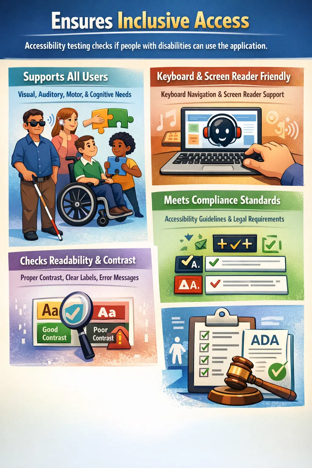
In real projects, accessibility testing is often treated as a special activity that happens late in the release cycle. That approach creates risk because accessibility issues are usually easier to prevent than to repair. If a form is built without proper labels, if buttons are created with non-semantic elements, or if error messages are not connected to input fields, fixing those issues later may require changes in markup, design, JavaScript behavior, and test coverage. Good accessibility testing encourages teams to think about inclusive usage from the beginning.
Accessibility also improves software for many users who may not identify as disabled. Clear labels help everyone. Good contrast helps users in bright environments. Keyboard support helps power users and people using temporary alternative input devices. Captions help users watching videos in quiet public spaces. Simple instructions help new users and users under stress. Because of this, accessibility should not be seen only as a compliance task. It is part of building usable, respectful, and reliable software.
Purpose of Accessibility Testing
The primary objective of accessibility testing is to ensure equal access to digital systems. It improves usability for diverse user groups, supports legal and regulatory compliance, and enhances overall user experience.
Accessibility is not only a compliance requirement; it is a quality attribute that reflects social responsibility and inclusive design. A system that excludes users because of poor keyboard behavior, missing labels, unreadable colors, or confusing content is incomplete from a quality perspective. The application may technically function, but it does not serve all intended users equally.
Another important purpose of accessibility testing is risk reduction. Many organizations operate in markets where accessibility expectations are connected to legal obligations, public procurement requirements, or internal corporate standards. A product that ignores accessibility can create legal exposure, reputational damage, customer complaints, and expensive rework. Testing helps identify these risks before they reach production.
Accessibility testing also supports better communication between design, development, QA, product, and business teams. When testers report that a field has no accessible name, or that a modal traps keyboard focus, the issue is not merely a cosmetic defect. It is a functional barrier for a real group of users. Framing accessibility defects as user-impacting quality problems helps teams prioritize them correctly.
Types of Disabilities Considered
Accessibility testing addresses multiple categories of disabilities. These categories help testers think about different interaction patterns instead of assuming that all users view, hear, understand, and operate software in the same way. The goal is not to memorize every medical condition, but to understand the barriers that software can create.
- Visual impairments such as blindness, low vision, and color blindness
- Auditory impairments such as hearing loss
- Motor impairments involving limited hand movement or difficulty using a mouse
- Cognitive challenges affecting learning, memory, or comprehension
For users with visual impairments, the application must provide information in ways that do not depend only on sight. Screen readers need meaningful page structure, properly labeled controls, descriptive links, and clear error messages. Users with low vision may depend on zoom, high contrast settings, larger fonts, or browser-level customization. If text becomes clipped when zoomed, if icons have no text alternatives, or if headings are used only for styling instead of structure, these users may struggle to understand the page.
For users with auditory impairments, audio-only information can become inaccessible. Videos may need captions, transcripts, or visible alternatives for important sound-based cues. If an application uses a notification sound to indicate success or failure, the same information should also be communicated visually or through text. Accessibility testing checks whether information is available through more than one channel when necessary.
Motor impairments affect how users interact with controls. Some users cannot use a mouse accurately, while others may rely on keyboard navigation, switch devices, voice input, or assistive hardware. Testers must verify that all important functionality can be completed without precise mouse movement. Small click targets, hover-only menus, inaccessible drag-and-drop actions, and missing focus indicators are common barriers for this group.
Cognitive accessibility focuses on understanding, memory, attention, and task completion. Complex language, inconsistent navigation, unexpected page changes, unclear instructions, and overloaded screens can create difficulty for users with cognitive challenges. Manual testers can contribute by checking whether workflows are predictable, labels are consistent, messages are direct, and users are not forced to remember information from previous screens unnecessarily.
Accessibility Standards (Conceptual Awareness)
Accessibility validation is often guided by recognized standards such as:
- WCAG (Web Content Accessibility Guidelines)
- Section 508 (United States compliance requirement)
- ADA (Americans with Disabilities Act) compliance principles
Manual testers are not expected to memorize every technical clause of these standards, but they should understand the conceptual expectations behind them. WCAG is commonly explained through four broad principles: content should be perceivable, operable, understandable, and robust. These principles are useful because they convert accessibility from a checklist into a way of thinking about user access.
Perceivable means users must be able to receive information in a way that works for them. Images need text alternatives when they communicate meaning. Videos need captions when speech is important. Text should have sufficient contrast against its background. Information should not be conveyed by color alone. If an error field is shown only with a red border, a color-blind user or screen reader user may miss the message unless text is also provided.
Operable means users must be able to use the interface. Keyboard accessibility is one of the strongest indicators here. A user should be able to reach controls, activate them, move through menus, close dialogs, and complete forms without becoming trapped. Focus order should follow a logical sequence. Components should not require impossible timing or precise pointer movements unless an accessible alternative is provided.
Understandable means the application should be predictable and clear. Labels should describe what fields expect. Error messages should explain what went wrong and how to fix it. Navigation should remain consistent across screens. When content changes dynamically, the user should not be confused or lose context. Robust means the application should work reliably with assistive technologies by using valid markup, semantic HTML, and standard control behavior wherever possible.
Role of the Manual Tester
Manual testers validate accessibility by interacting with the application using alternative methods. This includes navigating entirely with a keyboard, checking logical tab order, verifying visible focus indicators, and confirming that screen readers can interpret labels and content properly. The tester should not rely only on visual inspection because many accessibility problems are invisible when using a mouse and a monitor.
A practical manual testing session often begins with keyboard-only navigation. The tester starts at the top of the page, uses Tab and Shift+Tab to move through interactive elements, presses Enter or Space to activate controls, and observes whether the focus indicator is visible at all times. If focus disappears, jumps unexpectedly, enters hidden content, or becomes trapped inside a component, the application has a serious accessibility issue.
Testers also evaluate color contrast, font readability, clarity of error messages, and the presence of descriptive alternative text for images. They verify that labels are programmatically associated with form controls, not merely placed near them visually. They check whether icons that perform actions have accessible names, whether link text makes sense out of context, and whether page headings create a meaningful outline.
Another responsibility is reporting accessibility defects with enough evidence for developers and designers to act. A useful defect report should describe the user impact, the assistive method used, the expected behavior, and the actual barrier. For example, instead of saying "tab issue on popup," a stronger report says "keyboard focus remains behind the payment confirmation dialog, so a keyboard-only user cannot reach the Confirm or Cancel buttons." This makes the problem concrete and easier to prioritize.
Accessibility Testing Checklist
A structured manual checklist gives testers a repeatable starting point. It does not replace judgment, but it prevents common gaps during routine validation. A useful checklist should cover keyboard access, screen reader basics, forms, images, color, content clarity, dynamic behavior, and error handling.
- All functionality accessible via keyboard
- Logical and predictable tab navigation order
- Meaningful labels and descriptive alt text
- Clear, readable content with sufficient contrast
- No reliance on color alone to convey information
These checks help ensure inclusive design compliance, but testers should go deeper for important business flows. Login, registration, checkout, payment, search, profile update, password reset, and error recovery flows deserve careful accessibility testing because they directly affect user success. If a user cannot complete these flows with assistive technology or keyboard navigation, the application blocks real usage.
Checklist-based testing should also include responsive and zoom behavior. Many users increase browser zoom or use larger text settings. The application should remain usable when text is enlarged. Content should not overlap, buttons should remain reachable, and important messages should not disappear. A design that looks perfect at default size but breaks at higher zoom still creates an accessibility barrier.
For forms, testers should check labels, required field indicators, input instructions, validation messages, and correction guidance. Required fields should not be identified only by color or symbols without explanation. When an error occurs, the user should know which field has the problem and what action is needed. Ideally, the error message should be close to the field visually and available to assistive technology programmatically.
Keyboard Navigation as a Core Accessibility Check
Keyboard navigation is one of the most important manual accessibility checks because it reveals whether the interface can be operated without a mouse. A tester should be able to enter the page, move through all meaningful controls, open menus, select options, submit forms, close popups, and return to previous areas using keyboard commands alone. This is essential for users with motor impairments and also valuable for screen reader users.
The focus indicator must be visible and easy to identify. Removing the browser's default focus outline without providing a clear replacement is a common accessibility defect. If users cannot see where they are on the page, they cannot operate the interface confidently. Focus should also move in a logical order that follows the visual and functional structure of the page.
Special components require extra care. Modal dialogs should move focus into the dialog when opened and return focus to the triggering control when closed. Dropdown menus should be reachable and usable from the keyboard. Carousels should not auto-advance in a way that prevents users from reading content. Custom widgets should behave like familiar controls rather than forcing users to learn unexpected interaction patterns.
Screen Reader and Semantic Content Basics
Screen reader testing helps validate whether the application communicates structure and meaning correctly to non-visual users. Testers do not need to become advanced screen reader experts immediately, but they should understand basic expectations. A page should have a meaningful title, a clear heading structure, descriptive links, properly labeled buttons, and forms that announce labels and errors correctly.
Semantic HTML is the foundation of accessible screen reader behavior. Native elements such as buttons, links, headings, lists, tables, labels, and form controls already provide important accessibility information when used correctly. Problems often appear when teams replace semantic elements with generic containers and custom JavaScript behavior. A clickable div may look like a button visually, but it may not behave like a button for keyboard users or screen readers.
Testers should pay close attention to link and button names. Text such as "click here" or "read more" may be unclear when read out of context. Better labels explain the destination or action, such as "Download invoice" or "Read more about accessibility testing." Icon-only buttons should have an accessible name, otherwise a screen reader may announce them as unlabeled controls.
Color, Contrast, and Non-Color Signals
Color is useful for design, but it should not be the only way information is communicated. A required field, validation error, status message, chart legend, or warning state should include text, icons, patterns, or other cues in addition to color. This matters for users with color blindness, low vision, or display limitations.
Contrast affects readability. Light gray text on a white background may look modern but can be difficult to read. Error text, helper text, placeholder text, disabled states, and navigation labels should all be reviewed. Testers should be especially careful with small text and text placed over images or gradients, because readability can change depending on screen size and background position.
Visual states also need clear contrast. Focus states, selected states, hover states, and disabled states should be distinguishable. If the selected option in a tab group differs only by a slight shade, some users may not recognize the current state. Accessibility testing therefore includes both content readability and interaction clarity.
Forms and Error Accessibility
Forms are among the most important areas for accessibility testing because they often represent business-critical tasks. Registration, login, checkout, contact, application, and payment forms must be usable by everyone. A form can fail accessibility even when it submits data correctly if users cannot understand the fields, correct mistakes, or navigate the controls efficiently.
Each input should have a clear label. Placeholder text alone is not a reliable label because it disappears after typing and may not be announced consistently. Required fields should be identified clearly. Instructions should appear before users need them. If a field expects a specific format, such as date, phone number, or password rules, the guidance should be available before submission rather than only after an error.
Error handling is a major part of accessibility. After submitting a form with errors, users should be informed that errors exist, should be able to locate them easily, and should receive specific correction guidance. A message like "Invalid input" is weak because it does not explain the issue. A message like "Password must contain at least eight characters" is more useful. The error should also be connected to the relevant field for assistive technologies.
Accessibility Testing vs Usability Testing
Accessibility testing focuses on inclusivity and compliance for users with disabilities. Usability testing evaluates ease of use for all users. While both aim to improve user experience, accessibility testing ensures barrier-free interaction, whereas usability testing enhances efficiency and satisfaction.
Accessibility is compliance-driven; usability is experience-driven, but the two areas overlap strongly. An accessible application is often more usable because it provides clear structure, predictable navigation, readable text, meaningful messages, and flexible interaction methods. At the same time, a usable application is not automatically accessible. A visually simple page may still be unusable for screen reader users if labels are missing or focus management is broken.
The difference is important during planning. Usability testing may involve observing representative users and measuring how easily they complete tasks. Accessibility testing specifically checks whether users with disabilities and assistive technologies can access the same content and functionality. Both should be included in a mature quality strategy.
Real-Time Example
Consider testing an online registration form. A standard functional test may confirm that a user can enter name, email, password, accept terms, and submit successfully. Accessibility validation goes further. The tester navigates through the form using only the keyboard, confirms that focus moves in a logical order, checks that every field has a meaningful label, verifies that required fields are announced clearly, and confirms that the submit button can be activated without a mouse.
Next, the tester intentionally submits the form with missing or invalid information. The application should announce that errors exist, identify the affected fields, and provide clear correction instructions. If the email field is invalid, the message should explain the expected format. If the password does not meet rules, the rules should be described in plain language. The tester should verify that these messages are visible, readable, and accessible to screen readers.
If a user cannot complete the form without a mouse, accessibility compliance fails. If the screen reader announces "edit text blank" instead of "Email address," the form is not accessible. If the only error indication is a red border, the system excludes users who cannot perceive that color cue. These are not minor polish issues; they directly block task completion.
Common Accessibility Defects
Frequent issues include missing alternative text for images, poor color contrast, keyboard traps that prevent navigation, unlabeled form fields, and unclear or non-readable error messages. These defects create barriers that exclude users with disabilities.
Other common defects include duplicate page titles, missing heading structure, links that do not describe their purpose, buttons without accessible names, focus indicators removed by CSS, modals that do not manage focus, and dynamic content updates that are not announced. Tables may also create problems when headers are missing or when tables are used only for layout instead of data.
Media-related defects are also common. Videos may lack captions, transcripts may be missing, audio alerts may not have visible alternatives, and auto-playing media may distract users or interfere with assistive technology. Animations can create difficulty for some users if they cannot be paused or reduced.
Accessibility defects should be reported with severity based on user impact. A missing alt attribute on a purely decorative image may be minor if it does not affect understanding. A missing label on a payment field is much more serious because it can block completion of a critical workflow. Severity should reflect the barrier created, not only the technical rule violated.
Common Mistakes
One common mistake is treating accessibility as optional or secondary. Another is testing only visually without checking keyboard navigation or screen reader behavior. Accessibility validation must consider non-visual interaction paths. A tester who only uses a mouse may miss the most serious issues.
Another mistake is relying completely on automated tools. Automated accessibility scanners are useful and can quickly detect missing attributes, contrast problems, invalid markup, and some ARIA issues. However, they cannot fully determine whether alt text is meaningful, whether a workflow makes sense, whether instructions are understandable, or whether focus behavior feels logical. Manual judgment remains essential.
Teams also make mistakes with ARIA. ARIA can improve accessibility when used correctly, but it can also damage accessibility when used incorrectly. Native HTML should be preferred whenever possible. For example, a real button is usually better than a div with ARIA attributes and custom keyboard handling. Testers should flag custom controls that do not behave like the standard controls they are trying to imitate.
A final mistake is delaying accessibility testing until the end of the project. Late testing turns accessibility into rework. Early testing helps prevent defects by guiding design and development decisions before they become expensive to change. Accessibility should be included in requirements, design reviews, code reviews, test planning, and release validation.
Accessibility Testing in Agile Projects
In Agile projects, accessibility testing should be part of each sprint rather than a separate activity before release. User stories can include accessibility acceptance criteria, such as keyboard access, readable error messages, proper labels, and screen reader support for new components. This keeps accessibility connected to the work being delivered.
Testers can contribute during backlog refinement by asking accessibility-focused questions. Can the feature be used without a mouse? What happens when the user increases zoom? How will screen reader users understand this dynamic update? Are error messages visible and programmatically connected? These questions prevent vague acceptance criteria and reduce downstream defects.
Regression testing should also include accessibility checks for critical flows. When a shared component such as a modal, dropdown, navigation menu, date picker, or form field changes, accessibility regression risk is high. A small UI change can break focus order, labels, or keyboard behavior across many pages. Maintaining a compact accessibility regression checklist helps protect stability.
Documentation and Evidence
Accessibility testing produces valuable evidence for release decisions. Testers should document which pages or flows were checked, which assistive methods were used, what issues were found, and what risks remain. This is especially important for compliance-sensitive projects where teams may need to show that accessibility was considered seriously.
Defect reports should include clear reproduction steps and user impact. Screenshots can help for visual issues such as contrast or focus visibility, but they are not enough for screen reader or keyboard issues. For those problems, testers should describe the exact navigation sequence and the announcement or behavior observed. If possible, short screen recordings can make complex focus issues easier to understand.
Documentation should avoid vague statements like "page is not accessible." Instead, it should identify specific barriers. For example, "The country dropdown cannot be opened with keyboard focus using Enter or Space" is actionable. "The password field error is displayed visually but is not announced by the screen reader" is actionable. Specificity helps developers fix the issue and helps stakeholders understand impact.
Best Practices for Accessibility Testing
A strong accessibility testing approach begins with critical workflows. Test login, registration, checkout, search, account management, form submission, and error recovery before lower-risk pages. These are the areas where accessibility barriers cause the greatest business and user impact. Once high-value flows are covered, testers can expand to secondary content and edge cases.
Use a combination of methods. Manual keyboard testing reveals operability issues. Screen reader checks reveal communication problems. Visual review catches contrast and layout concerns. Automated tools provide fast detection for common technical violations. Together, these approaches create stronger coverage than any single method alone.
Prefer prevention over detection. Encourage semantic HTML, accessible design patterns, reusable components, and accessibility acceptance criteria. When teams build accessible components once and reuse them consistently, quality improves and testing effort becomes more efficient. Accessibility should become part of the system's design language rather than a repeated cleanup task.
Limitations of Manual Accessibility Testing
Manual accessibility testing is powerful, but it has limits. Testers may not represent every disability, every assistive technology, or every user environment. Screen reader behavior can differ across tools and browsers. A workflow that works well in one combination may behave differently in another. Because of this, accessibility testing should be risk-based and should use representative tools where possible.
Automated tools also have limits, and manual testing has human limits. The most mature approach combines automated scanning, manual validation, design review, code review, and where possible, feedback from users with disabilities. This layered approach gives a more realistic picture of accessibility quality.
Interview Perspective
In interviews, accessibility testing is typically defined as validating that applications can be used by individuals with disabilities. A strong explanation emphasizes compliance with recognized standards and ensuring inclusive usability across visual, auditory, motor, and cognitive dimensions.
A practical interview answer should mention keyboard navigation, screen reader support, meaningful labels, alt text, color contrast, focus indicators, captions, accessible error messages, and avoiding reliance on color alone. It is also useful to explain that accessibility testing is not only tool-based. Automated scanners help, but manual validation is required to judge real user experience and task completion.
A strong candidate can also compare accessibility testing with usability testing. Accessibility focuses on removing barriers for users with disabilities and meeting standards. Usability focuses on ease, efficiency, and satisfaction for users generally. Both improve product quality, but accessibility has a stronger inclusion and compliance focus.
Key Takeaway
Accessibility Testing ensures that software is inclusive, compliant, and usable by everyone. It transforms applications from being merely functional into being universally accessible, reinforcing both quality and social responsibility.
The most important lesson is that accessibility is not a final decoration added after development. It is a quality expectation that affects design, code, content, testing, and release decisions. When accessibility is handled early and tested consistently, the product becomes easier to use, easier to maintain, and more respectful of real user diversity.