Viewport Meta Tag
Introduction
The viewport meta tag is one of the most important meta tags in modern HTML. It controls how a webpage is displayed on different screen sizes, especially on mobile phones and tablets. Without this tag, even a well-designed webpage may appear too small, zoomed out, or difficult to use on mobile devices.
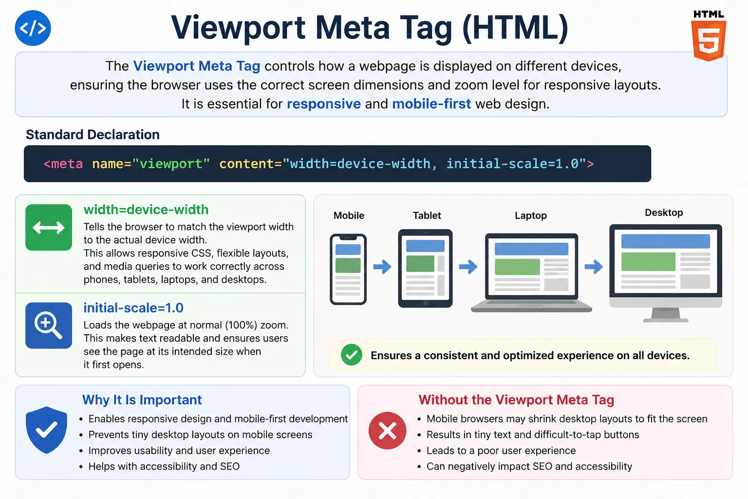
In the early days of the web, most websites were designed for desktop screens. Pages were commonly built with fixed widths such as 960px or 980px. When mobile browsers became popular, they had a problem: desktop websites were much wider than mobile screens. To solve this temporarily, mobile browsers displayed the page inside a large virtual viewport and then scaled the entire page down to fit the phone screen. This made websites technically visible, but the user experience was poor. Text became tiny, buttons were hard to tap, and users had to pinch and zoom repeatedly.
The viewport meta tag was introduced to solve this problem. It tells the browser how to control the visible area of the webpage and how to scale the layout. The most common viewport meta tag used today is:
<meta name="viewport" content="width=device-width, initial-scale=1.0">This simple line tells the browser to use the actual device width as the viewport width and load the page at normal zoom. It is a foundation of responsive web design.
What Is a Viewport?
A viewport is the visible area of a webpage inside the browser window. In simple terms, it is the screen space available for displaying web content.
For example, when a user opens a webpage on a mobile phone, the viewport is the visible area inside the mobile browser. When a user opens the same webpage on a laptop, the viewport is the browser window area on that laptop.
Different devices have different viewport sizes. A mobile phone may have a viewport width between 320px and 480px. A tablet may have a viewport width around 768px to 1024px. A laptop may have a viewport width of 1366px or more, while a desktop monitor may have 1920px or higher.
Because devices vary so much, a webpage cannot be designed only for one screen size. It must adapt. The viewport meta tag helps the browser understand how to scale and display the page correctly across devices.
What Is the Viewport Meta Tag?
The viewport meta tag is an HTML meta tag placed inside the <head> section of a webpage. It gives instructions to the browser about how the page should be displayed on different devices.
Example:
<meta name="viewport" content="width=device-width, initial-scale=1.0">This tag tells the browser:
“Use the actual width of the device as the viewport width and display the page at 100% zoom.”
The viewport meta tag is especially important for mobile devices. Without it, mobile browsers may assume the webpage is designed for desktop screens and display it using a virtual desktop-sized viewport. This causes the page to shrink, making text and buttons too small.
Why the Viewport Meta Tag Was Needed
Before responsive design became standard, websites were mostly created for desktop screens. A common layout width was around 980px.
This worked well on desktop monitors. But when viewed on a phone with a width of around 375px, the browser had to decide how to display a much wider page on a small screen.
Without a viewport meta tag, many mobile browsers assume a virtual width, often around 980px. The browser then shrinks the full desktop layout to fit the mobile screen.
The result is usually poor:
Text becomes very small, buttons become difficult to tap, users need to zoom manually, horizontal scrolling may appear, and the overall experience feels uncomfortable.
The viewport meta tag fixes this by telling the browser to use the actual device width instead of a virtual desktop width.
Problem Without the Viewport Meta Tag
Consider a simple HTML document without a viewport tag:
<head>
    <title>My Website</title>
</head>
On a desktop browser, this may look normal. But on a mobile browser, the browser may assume that the page is designed for a wide desktop layout. It may use a virtual viewport width such as 980px and then scale the page down to fit the mobile screen.
This creates a tiny version of the desktop website on the phone. Users may need to zoom in to read text or tap buttons.
This is not considered mobile-friendly.
For modern websites, missing the viewport tag is a serious issue because most users browse websites from mobile devices.
Solution: Using the Viewport Meta Tag
The standard solution is:
<meta name="viewport" content="width=device-width, initial-scale=1.0">After adding this tag, the browser uses the actual device width as the viewport width. If the device width is 375px, the browser treats the layout viewport as 375px. If the device width is 768px, it uses 768px.
This allows CSS media queries to work correctly and enables responsive layouts.
With the viewport tag, the page can adjust naturally to different screen sizes. Text becomes readable, buttons become easier to tap, and the layout can respond properly to mobile, tablet, laptop, and desktop screens.
Anatomy of the Viewport Meta Tag
The viewport meta tag has two main parts:
<meta name="viewport" content="width=device-width, initial-scale=1.0">The first part is:
name="viewport"This identifies the meta tag as a viewport configuration tag.
The second part is:
content="width=device-width, initial-scale=1.0"This contains the actual viewport settings.
The two most important settings are width=device-width and initial-scale=1.0.
Understanding width=device-width
The setting:
width=device-widthmeans the viewport width should match the actual device width.
For example, if the user is using an iPhone, the viewport width should match the iPhone’s browser viewport. If the user is using an Android phone, the viewport width should match that device’s width. If the user is using a tablet, the viewport width should match the tablet’s width.
Without this setting, the browser may use a virtual desktop viewport instead.
This property is essential for responsive design because CSS media queries depend on viewport width.
Example:
@media (max-width: 768px) {
    body {
        font-size: 14px;
    }
}
This media query works correctly only when the browser understands the real viewport width.
Understanding initial-scale=1.0
The setting:
initial-scale=1.0means the page should load at 100% zoom.
A scale of 1.0 means normal size. A scale of 2.0 means 200% zoom. A scale of 0.5 means 50% zoom.
For most websites, initial-scale=1.0 is the correct setting because it displays the page at a natural size when it first loads.
Together, width=device-width and initial-scale=1.0 give the browser the correct instructions for responsive rendering.
Standard Viewport Configuration
The most commonly used viewport meta tag is:
<meta name="viewport" content="width=device-width, initial-scale=1.0">This is considered the standard for modern websites.
It should be included in almost every responsive HTML document.
A basic modern HTML structure looks like this:
<!DOCTYPE html>
<html lang="en">
<head>
    <meta charset="UTF-8">
    <meta name="viewport" content="width=device-width, initial-scale=1.0">
    <title>SoftwareTips4U</title>
</head>
<body>
    <h1>Responsive HTML Page</h1>
</body>
</html>
This page is now prepared for proper rendering on mobile phones, tablets, laptops, and desktops.
Viewport and Responsive Design
Responsive design means designing webpages that adapt to different screen sizes. The viewport meta tag is one of the foundations of responsive design.
CSS media queries depend on viewport dimensions.
Example:
@media (max-width: 768px) {
    body {
        font-size: 14px;
    }
}
This rule says that when the viewport width is 768px or smaller, the font size should become 14px.
If the viewport tag is missing, the browser may not use the actual device width. As a result, media queries may not behave as expected.
The viewport tag allows mobile-first layouts, flexible grids, responsive images, and adaptive typography to work correctly.
Viewport and Mobile-First Design
Modern web development often follows a mobile-first approach. This means developers design the page first for small screens and then enhance it for larger screens.
The typical flow is:
Mobile first, then tablet, then laptop, then desktop.
The viewport meta tag makes this possible because it allows the browser to use the actual device width. Once the browser knows the real viewport size, CSS can apply appropriate rules for each screen size.
Example:
body {
    font-size: 14px;
}
@media (min-width: 768px) {
    body {
        font-size: 16px;
    }
}
@media (min-width: 1200px) {
    body {
        font-size: 18px;
    }
}
This approach works properly only when the viewport is configured correctly.
Additional Viewport Properties
Although the standard viewport tag is enough for most websites, there are additional viewport properties.
One property is maximum-scale.
Example:
<meta name="viewport" content="maximum-scale=2.0">This allows users to zoom in up to 200%.
Another property is minimum-scale.
Example:
<meta name="viewport" content="minimum-scale=0.5">This allows users to zoom out to 50%.
Another property is user-scalable.
Example:
<meta name="viewport" content="user-scalable=yes">This allows users to manually zoom the page.
Some developers use:
<meta name="viewport" content="user-scalable=no">This disables zooming. However, this is generally discouraged because it can hurt accessibility. Some users need zoom functionality to read content comfortably.
Accessibility Impact
The viewport meta tag affects accessibility because it influences readability and touch usability.
A properly configured viewport helps text appear at a readable size on mobile devices. It also helps buttons, links, and form controls appear at usable sizes.
However, disabling zoom can create accessibility problems.
For example:
<meta name="viewport" content="user-scalable=no">This prevents users from zooming in. Users with low vision may struggle to read content. Because of this, developers should avoid disabling zoom unless there is a very strong reason.
A good viewport setup supports accessibility by allowing flexible and readable layouts.
SEO Impact
The viewport tag also affects SEO indirectly.
Search engines care about mobile usability. A page that displays poorly on mobile devices creates a bad user experience. Since mobile-friendliness is important for search visibility, the viewport tag becomes an important technical SEO factor.
A page with a proper viewport tag is more likely to render correctly on mobile devices.
The standard SEO-friendly configuration is:
<meta name="viewport" content="width=device-width, initial-scale=1.0">This helps create a mobile-friendly webpage, which supports better user experience and search performance.
Browser Processing Flow
When the browser encounters this tag:
<meta name="viewport" content="width=device-width, initial-scale=1.0">it processes the viewport settings early during page loading.
The flow looks like this:
Browser reads the viewport settings, sets the viewport width, applies the initial zoom level, calculates the layout, applies CSS media queries, and renders the page.
This means the viewport tag directly affects layout calculation.
Without it, the browser may calculate layout using a virtual desktop width instead of the device width.
Viewport and Selenium Testing
Viewport behavior is important in Selenium automation testing, especially for responsive testing.
Selenium can resize the browser window:
driver.manage().window().setSize(new Dimension(375, 812));This simulates a mobile-like viewport size.
When the viewport meta tag is correctly configured, the page should respond to that size using responsive CSS.
Automation testers can validate whether menus, buttons, cards, forms, and layouts behave correctly across viewport sizes.
For example, a desktop navigation bar may become a hamburger menu at mobile width. Selenium can verify this by changing the browser size and checking the DOM or UI behavior.
Common Mistakes
One common mistake is missing the viewport tag completely.
Bad:
<head>
    <title>My Site</title>
</head>
This may cause poor mobile rendering.
Another mistake is using a fixed viewport width.
Bad:
<meta name="viewport" content="width=980">This forces the page to use a fixed width and can create layout issues on small devices.
Another mistake is disabling zoom.
Bad:
<meta name="viewport" content="width=device-width, initial-scale=1.0, user-scalable=no">This can reduce accessibility.
The best default choice is:
<meta name="viewport" content="width=device-width, initial-scale=1.0">Without Viewport vs With Viewport
Without the viewport meta tag, mobile browsers may show a desktop-sized layout shrunk onto the phone screen. Text may be tiny, buttons may be difficult to tap, zooming may be required, and the user experience may be poor.
With the viewport meta tag, the page uses the actual device width. Text becomes readable, buttons become usable, media queries work correctly, and the layout becomes responsive.
The difference is simple:
Without viewport: desktop-sized layout on mobile.
With viewport: responsive layout based on actual device width.
Common Interview Questions
A common question is: What is a viewport?
A viewport is the visible area of a webpage inside the browser window.
Another question is: Why is the viewport meta tag used?
It is used to control page scaling and responsive behavior across different devices.
What does width=device-width mean?
It means the viewport width should match the actual device width.
What does initial-scale=1.0 mean?
It means the page should load at 100% zoom.
Is the viewport tag important for responsive design?
Yes. It is essential for responsive design.
Interview-Ready Answer
The viewport meta tag controls how a webpage is displayed on different devices. It tells the browser to use the actual device width as the viewport width and sets the initial zoom level. The standard configuration is <meta name="viewport" content="width=device-width, initial-scale=1.0">. This tag is essential for responsive web design because it ensures that pages render correctly on mobile phones, tablets, laptops, and desktops.
Key Takeaway
The viewport meta tag is a small but essential part of modern HTML. It allows webpages to adapt correctly to different screen sizes by telling the browser how to set the visible area and initial zoom level.
Without it, mobile browsers may display desktop layouts in a tiny, zoomed-out form. With it, responsive CSS can work properly, text becomes readable, buttons become usable, and the user experience improves across devices.
For modern web development, the standard viewport tag should almost always be included:
<meta name="viewport" content="width=device-width, initial-scale=1.0">One-Line Insight
The viewport meta tag tells the browser: “Display this page using the actual device size, not a desktop-sized virtual screen.”