Real-World Form Design Mistakes
Introduction
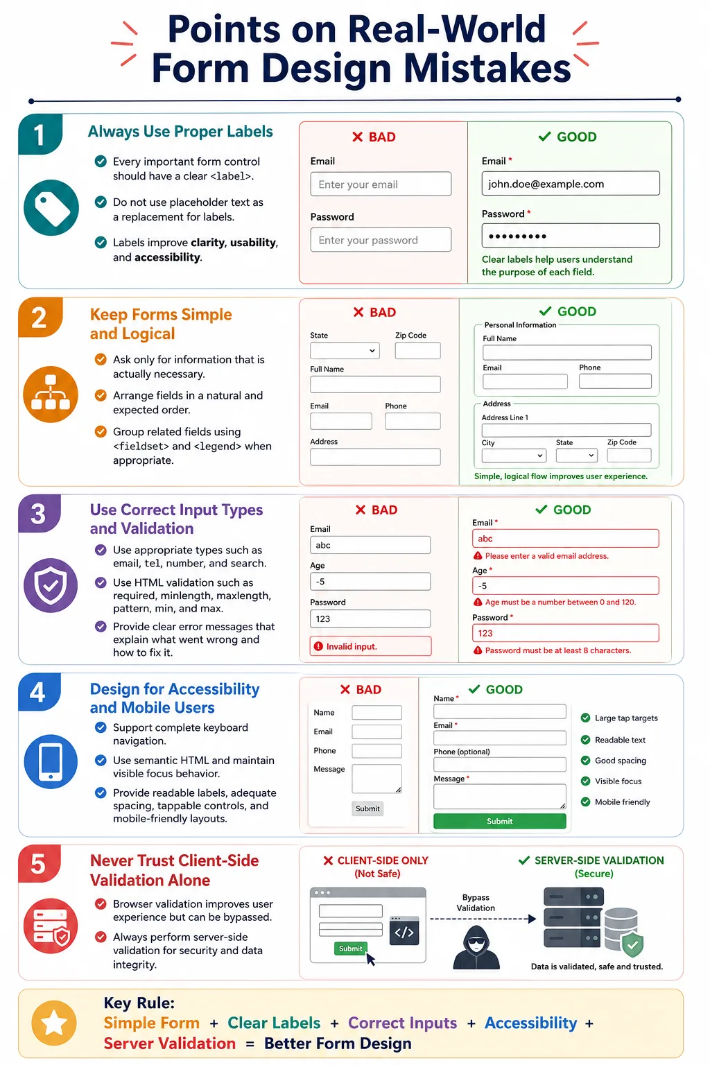
Forms are one of the most important parts of a web application. They are the point where users log in, create accounts, submit details, make payments, contact support, search content, update profiles, and complete business workflows. Even if the backend works perfectly, poor form design can still confuse users, increase errors, reduce conversions, create accessibility problems, and make the application feel unprofessional.
Good form design focuses on simplicity, clarity, accessibility, validation, and user experience. A form should guide users toward successful completion. It should ask only for necessary information, use meaningful labels, choose the correct input types, provide helpful validation, support keyboard navigation, and work well on mobile devices. When these details are ignored, users may enter incorrect data, abandon the form, or need extra support.
Understanding common real-world form design mistakes helps developers, testers, designers, and interview candidates evaluate forms more professionally. A good form does not merely collect data. It helps users enter the right data quickly, accurately, and accessibly.
Why Form Design Matters
A poorly designed form can lead to user frustration, incorrect data entry, form abandonment, increased support requests, lower conversion rates, and accessibility failures. A form may look visually attractive, but if users cannot understand what to enter, cannot fix errors, cannot use the keyboard, or cannot complete it on mobile, the form is not effective.
Poor form
  |
User confused
  |
Errors
  |
Leaves website
Good form design encourages users to complete the process successfully. It removes unnecessary friction, gives clear instructions, and provides immediate feedback when something goes wrong. It also improves data quality because users are less likely to submit incomplete or incorrect values.
Mistake 1: Missing Labels
One of the most serious mistakes is creating input fields without labels.
<input type="email">This field gives no clear indication of what information should be entered. A sighted user may be confused if the surrounding context is unclear, and a screen reader user may hear only a generic control such as "edit text."
A better version uses a proper label connected to the input.
<label for="email">Email Address</label>
<input type="email" id="email">
Labels improve accessibility, usability, and clarity. They should be present for every important form control.
Mistake 2: Using Placeholder Instead of Label
Another common mistake is using placeholder text as a replacement for a label.
<input placeholder="Email">At first, the field looks understandable because the placeholder appears inside the input. But when the user starts typing, the placeholder disappears.
john@example.comNow the user can no longer see what the field represents. This is especially problematic in long forms, mobile forms, and forms with validation errors. A better design uses a label for the permanent field name and a placeholder only as a hint.
<label for="email">Email</label>
<input id="email" placeholder="john@example.com">
Mistake 3: Asking for Too Much Information
Long forms discourage users. A registration form that asks for first name, middle name, last name, nickname, gender, age, birthday, country, city, ZIP, occupation, company, department, designation, experience, and salary may feel excessive if most of that information is not required to create an account.
Every additional field adds friction. Users ask themselves why the application needs the information and whether completing the form is worth the effort. The better approach is to ask only for information that is necessary at that step. Additional details can be collected later if they are truly needed.
Mistake 4: Poor Field Order
Field order should match user expectations. A form that asks for password, then email, then username feels unnatural because users usually expect identity fields before password fields.
Bad:
Password
Email
Username

Better:
Username
Email
Password
Logical ordering reduces cognitive effort. Users should not have to stop and think about why the form is asking questions in an unusual sequence.
Mistake 5: Wrong Input Type
Using the wrong input type is a common technical and usability mistake. For example, using a text input for an email field loses the browser's built-in email behavior.
<input type="text">A better version is:
<input type="email">The correct input type enables built-in validation, better mobile keyboards, semantic meaning, and improved user experience. Phone fields should often use type="tel", numeric quantities may use type="number", and search fields can use type="search".
Mistake 6: No Client-Side Validation
Without client-side validation, users may submit an incomplete form, wait for a server response, and then receive errors after a delay.
Submit
  |
Server rejects
  |
Reload page
A better flow gives immediate feedback in the browser.
Browser validates
  |
Immediate feedback
Use HTML5 validation attributes such as required, type="email", minlength, maxlength, pattern, min, and max. Use JavaScript when custom business validation is needed.
Mistake 7: Unclear Error Messages
Error messages should help users fix the problem. A message that simply says "Error" is not useful because it does not explain what went wrong or how to correct it.
Bad:
Error

Better:
Password must contain at least 8 characters.
Clear error messages reduce frustration. They should identify the field, explain the issue, and provide a correction path. If possible, show the message near the relevant field.
Mistake 8: Using Reset Buttons Unnecessarily
Reset buttons can erase all entered data. In older forms they were more common, but modern web applications often omit them because accidental clicks can be costly.
<button type="reset">Reset</button>If a user spends several minutes filling a form and accidentally clicks Reset, the result is frustration. Use reset buttons only when they provide real value and when the design prevents accidental data loss.
Mistake 9: Ignoring Accessibility
Forms without labels, grouping, keyboard support, or semantic structure can be difficult or impossible for some users to complete.
<input>
<input>
<input>
A better form uses <label>, <fieldset>, and <legend> where appropriate. It supports keyboard navigation and uses semantic HTML elements instead of custom clickable containers whenever possible.
Mistake 10: Poor Button Text
Button text should describe the action clearly. A button that says "Go" may be ambiguous.
<button>Go</button>A better button says exactly what will happen.
<button>Create Account</button>Descriptive button text helps users confirm that they are taking the intended action. It is also useful for screen reader users and automated tests.
Mistake 11: Showing Errors Only After Submission
If users complete an entire form and then see fifteen errors after clicking Submit, the experience feels discouraging. Timely feedback is better.
Bad:
Complete entire form
  |
Submit
  |
15 errors
A better workflow validates fields at helpful moments, such as after leaving a field or before moving to the next step.
Complete field
  |
Validate
  |
Show error
  |
Continue
Validation should not be aggressive or distracting, but it should help users correct mistakes before they pile up.
Mistake 12: Not Grouping Related Fields
Long forms become easier to understand when related fields are grouped. A list such as name, city, password, phone, country, and email feels scattered. Grouping creates structure.
Personal Information
  Name
  Email
  Phone

Address
  City
  Country

Account
  Password
Use <fieldset> and <legend> for meaningful groups, especially when controls belong to one question or section.
Mistake 13: Poor Mobile Experience
Forms must work well on mobile devices. Choosing the wrong input type can make mobile entry harder. For example, a phone number field should often use type="tel" so the device can show a phone-friendly keyboard.
<input type="tel">Mobile form design also needs readable labels, adequate spacing, tappable controls, logical field order, and layouts that do not force users to zoom or scroll sideways.
Mistake 14: No Autofill Support
Autofill can make forms much faster to complete. A field may technically work without autofill, but users lose a convenience that browsers can provide.
<input type="email">A better version includes autocomplete where appropriate.
<input type="email" autocomplete="email">Autofill is especially helpful for names, emails, phone numbers, addresses, usernames, and passwords. It reduces typing effort and helps avoid mistakes.
Mistake 15: Using Disabled Instead of Readonly
Disabled and read-only fields behave differently during form submission. A disabled field is not submitted.
<input value="India" disabled>If the server needs the value, this is wrong. Use readonly when the value should be visible, uneditable, and still submitted.
<input value="India" readonly>Mistake 16: Weak Password Requirements
Password requirements should be clear. If the form allows abc as a password, the account may be weak. If the form rejects passwords without explaining why, users become frustrated.
A better design communicates requirements such as minimum 8 characters, uppercase letter, number, and special character. These instructions should remain visible or be easy to access while the user types.
Mistake 17: Not Indicating Required Fields
Users should know which fields are mandatory before they submit the form. A common approach is to mark required fields with an asterisk and use the required attribute.
<label for="email">Email *</label>
<input type="email" id="email" required>
If an asterisk is used, provide a note explaining what it means. Do not make users guess which fields are required.
Mistake 18: Ignoring Keyboard Users
Users should be able to complete a form using the keyboard. They should be able to press Tab to move to the next field, Shift + Tab to move backward, Space to toggle checkboxes, and Enter to submit when appropriate.
Tab
  |
Next field
  |
Enter
  |
Submit
Avoid trapping keyboard focus, hiding focus indicators, or requiring mouse-only interaction. Keyboard support is a core accessibility requirement.
Mistake 19: Poor Form Layout
A cluttered layout makes forms harder to scan. Placing too many fields on one line can create confusion, especially on smaller screens.
Bad:
Name Email Password Phone City Country
A better layout gives each field enough space and uses logical grouping.
Name
Email
Password
Phone
Good spacing, alignment, and grouping help users move through the form without visual overload.
Mistake 20: Trusting Client-Side Validation Alone
Client-side validation improves user experience, but it does not secure the application.
Bad assumption:
HTML validation
  |
Secure
This assumption is incorrect. Users can bypass browser validation, disable JavaScript, modify requests, or call APIs directly. Always validate again on the server. Server-side validation protects data integrity and application security.
Browser Workflow
A well-designed form guides the user from start to finish. The user opens the form, reads labels, completes fields, receives validation feedback, fixes errors, submits the form, and then the server validates the data before success.
User opens form
  |
Reads labels
  |
Completes fields
  |
Validation
  |
Fix errors
  |
Submit
  |
Server validation
  |
Success
This flow works best when every layer is designed intentionally. HTML structure, validation, accessibility, layout, and backend validation all contribute to the final experience.
Real-World Example
A well-designed registration form uses labels, fieldset, legend, correct input types, validation, autofill support, and descriptive button text.
<form>
  <fieldset>
    <legend>Account Information</legend>

    <label for="name">Full Name</label>
    <input
      type="text"
      id="name"
      required
      autocomplete="name">

    <label for="email">Email Address</label>
    <input
      type="email"
      id="email"
      required
      autocomplete="email">

    <label for="password">Password</label>
    <input
      type="password"
      id="password"
      required
      minlength="8"
      autocomplete="new-password">

    <button type="submit">Create Account</button>
  </fieldset>
</form>
This form is not complicated, but it avoids many common mistakes. It has persistent labels, semantic grouping, native validation, autofill support, and clear action text.
Selenium Perspective
Automation testers commonly verify labels, field order, required fields, validation messages, button functionality, keyboard navigation, accessibility, responsive layout, and form submission. Selenium can fill fields and verify button text.
driver.findElement(
    By.id("email"))
    .sendKeys("john@example.com");
Button text can be verified like this:
String text =
driver.findElement(
    By.tagName("button"))
    .getText();

System.out.println(text);
Good form testing should include positive scenarios, validation failures, keyboard navigation, mobile checks, accessibility checks, and server-side validation behavior.
Form Design Checklist
| Best Practice | Purpose |
|---|---|
| Use labels | Clear field identification |
| Choose correct input types | Better validation and mobile support |
| Validate early | Immediate feedback |
| Show helpful error messages | Easier error correction |
| Group related fields | Better organization |
| Use descriptive buttons | Clear actions |
| Support keyboard navigation | Accessibility |
| Enable autofill | Faster completion |
| Validate on the server | Security |
Common Interview Questions
Why should placeholders not replace labels? Because placeholders disappear when users type and do not provide the same accessibility and usability benefits as labels.
Why should reset buttons be used carefully? Users can accidentally erase all entered data, leading to frustration.
Why is the correct input type important? It enables browser validation, optimized mobile keyboards, and better user experience.
Why is server-side validation still required? Client-side validation can be bypassed, so the server must always validate incoming data.
Why should related fields be grouped? Grouping improves readability, accessibility, and helps users understand the structure of the form.
Interview-Ready Answer
Good form design improves usability, accessibility, and data quality. Common mistakes include missing labels, using placeholders instead of labels, choosing incorrect input types, displaying unclear validation messages, overusing reset buttons, ignoring accessibility, poor field ordering, weak password guidance, and relying solely on client-side validation. Well-designed forms use semantic HTML, provide immediate and meaningful feedback, support keyboard navigation, and always perform server-side validation in addition to client-side validation.
One-Line Insight
A great form does not just collect data; it guides users to enter the right data quickly, accurately, and accessibly.