What Is CSS?
CSS is one of the foundational technologies of the modern web. Every visually appealing website, responsive application, dashboard, e-commerce platform, or mobile-friendly interface depends heavily on CSS. While HTML provides the structure of a webpage and JavaScript adds behavior and interactivity, CSS is responsible for presentation, layout, visual styling, responsiveness, and user experience. Without CSS, the internet would look like plain documents with minimal formatting and almost no modern visual design.
CSS stands for Cascading Style Sheets. It is a stylesheet language used to define how HTML elements should appear on screen. CSS controls colors, fonts, spacing, positioning, layouts, animations, responsiveness, and much more. It transforms raw HTML into professional, usable, visually engaging interfaces.
Understanding CSS deeply is essential not only for frontend developers but also for automation engineers, UI testers, full-stack developers, accessibility specialists, and performance engineers. Modern web development cannot function effectively without strong CSS knowledge.
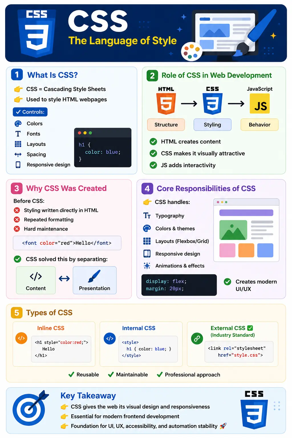
Introduction to CSS
At its core, CSS separates presentation from content. HTML defines what content exists, while CSS defines how that content looks.
For example, HTML may define a heading:
<h1>Welcome to SoftwareTips4U</h1>
CSS defines how that heading should appear:
h1 {
    color: blue;
    text-align: center;
}
The browser combines HTML structure with CSS styling to render the final visual output. This separation creates cleaner architecture, easier maintenance, reusable design systems, and scalable frontend development.
Why CSS Was Created
In the early days of the web, HTML was used for both structure and styling. Developers used tags like:
<font color="red">
This created several major problems:
- Repeated styling everywhere
- Difficult maintenance
- Poor scalability
- Ugly, cluttered markup
- Tight coupling between content and design
As websites became larger and more complex, this approach became unsustainable. CSS was introduced to solve these issues by separating design from content.
This separation provided several advantages:
- Reusable styling rules
- Cleaner HTML documents
- Easier design updates
- Better maintainability
- Consistent UI design across pages
Modern web architecture fundamentally depends on this separation of concerns.
What Does “Cascading” Mean?
The word “Cascading” is one of the most important concepts in CSS. It refers to how multiple style rules are prioritized and applied to the same element.
Example:
p {
    color: blue;
}

p {
    color: red;
}
Final output:
red
The later rule overrides the earlier rule because CSS follows cascading and specificity rules.
The cascade determines:
- Which styles win
- Which rules override others
- How inheritance behaves
- How browser defaults interact with developer styles
Mastering the cascade is essential for debugging complex styling issues.
Core Responsibilities of CSS
CSS handles nearly every visual aspect of a webpage.
Colors
CSS controls text color, backgrounds, gradients, transparency, and theme systems.
color: red;
background-color: yellow;
Modern design systems rely heavily on CSS for branding consistency.
Typography
CSS defines fonts, font sizes, spacing, alignment, and text appearance.
font-size: 20px;
font-family: Arial;
font-weight: bold;
Typography plays a critical role in readability and user experience.
Spacing
Margins and padding are controlled using CSS.
margin: 20px;
padding: 10px;
Proper spacing creates visually balanced layouts.
Layouts
Modern CSS provides advanced layout systems such as Flexbox and Grid.
display: flex;
display: grid;
These systems allow developers to build responsive and scalable interfaces without relying heavily on JavaScript.
Responsive Design
CSS enables websites to adapt to different screen sizes.
@media screen and (max-width: 768px)
Responsive design is now mandatory because applications must support:
- Mobile devices
- Tablets
- Desktops
- Large screens
Animations and Effects
CSS supports transitions and animations.
transition: 0.3s;
animation: slide 2s;
Modern user interfaces rely heavily on smooth visual interactions.
CSS Syntax Structure
CSS follows a simple but powerful syntax structure.
Basic syntax:
selector {
    property: value;
}
Example:
h1 {
    color: blue;
}
Breakdown:
| Part | Meaning |
|---|---|
| h1 | Selector |
| color | Property |
| blue | Value |
Selectors target elements, properties define style aspects, and values specify the styling behavior.
Types of CSS
There are three primary ways to apply CSS.
Inline CSS
Styles are written directly inside HTML elements.
<h1 style="color:red;">Hello</h1>
Advantages:
- Quick testing
Disadvantages:
- Poor maintainability
- Not reusable
- Violates clean architecture principles
Inline CSS is discouraged in enterprise development.
Internal CSS
CSS is written inside the <style> tag.
<style>
h1 {
   color: blue;
}
</style>
Useful for:
- Small pages
- Demos
- Learning environments
However, it is not ideal for large-scale applications.
External CSS (Industry Standard)
CSS is placed in separate .css files.
<link rel="stylesheet" href="style.css">
Benefits include:
- Reusability
- Clean architecture
- Better maintenance
- Faster development
- Browser caching support
External CSS is the professional standard in real-world applications.
How CSS Works Internally
CSS is deeply integrated into browser rendering.
The rendering workflow is:
HTML Loaded
↓
DOM Created
↓
CSS Loaded
↓
CSSOM Created
↓
DOM + CSSOM
↓
Render Tree
↓
Page Displayed
The browser parses HTML into the DOM and CSS into the CSSOM. These structures combine to form the Render Tree, which determines how elements appear visually.
Poor CSS architecture can negatively impact rendering performance.
Relationship Between HTML, CSS, and JavaScript
Modern web applications rely on three core technologies:
| Technology | Responsibility |
|---|---|
| HTML | Structure |
| CSS | Styling |
| JavaScript | Behavior |
Example:
- HTML creates a button
- CSS styles the button
- JavaScript adds click functionality
These technologies work together to create complete user experiences.
Real-World Importance of CSS
Modern applications are impossible without CSS.
CSS is heavily used in:
- Responsive websites
- SaaS platforms
- Dashboards
- E-commerce systems
- Mobile-first applications
- Dark mode systems
- Design systems
- Enterprise web applications
Every modern UI framework depends on CSS internally.
Modern CSS Features
Modern CSS is far more powerful than early CSS versions.
Advanced features include:
- Flexbox
- CSS Grid
- CSS Variables
- Media Queries
- Container Queries
- Animations
- Logical Properties
- CSS Layers
Modern CSS can create highly sophisticated interfaces with minimal JavaScript.
CSS in Frameworks
Even when developers use frameworks like:
- Bootstrap
- Tailwind CSS
- Material UI
- Chakra UI
- Styled Components
they are still fundamentally relying on CSS concepts. Frameworks do not eliminate CSS—they abstract and organize it.
Without understanding CSS fundamentals, developers struggle with customization and debugging.
Common Misconceptions About CSS
Myth: CSS Is Easy
Basic CSS is simple, but advanced CSS architecture is highly complex.
Professional frontend systems involve:
- Responsive layouts
- Accessibility
- Design systems
- Cross-browser compatibility
- Animation performance
- Rendering optimization
Myth: CSS Is Not Programming
Modern CSS supports:
- Variables
- Functions
- Calculations
- Dynamic layouts
- Conditional behavior
CSS has evolved significantly.
Myth: CSS Is Only for Designers
CSS is critical for:
- Frontend developers
- QA engineers
- SDETs
- Accessibility specialists
- SEO engineers
Automation engineers especially depend on stable CSS structures for reliable locators.
Challenges in CSS
CSS can become difficult in large applications.
Common problems include:
- Specificity conflicts
- Layout breaking
- Z-index issues
- Cross-browser inconsistencies
- Inheritance confusion
- Responsive failures
These issues require deep understanding of browser behavior.
CSS and Test Automation
CSS plays a major role in UI automation.
Automation tools use:
- CSS selectors
- DOM structure
- Stable attributes
Poor CSS architecture often causes:
- Flaky tests
- Unstable locators
- Timing issues
Well-structured HTML and CSS improve automation reliability significantly.
CSS Performance Considerations
CSS impacts rendering performance directly.
Large or poorly designed stylesheets can cause:
- Slow rendering
- Excessive repaints
- Layout thrashing
- Rendering bottlenecks
Best practices include:
- Minimizing unnecessary nesting
- Avoiding overly complex selectors
- Reducing unused CSS
- Optimizing animations
Performance-aware CSS design is essential in enterprise applications.
Best Practices
Professional CSS development follows several best practices.
Recommended approaches:
- Use external CSS files
- Prefer reusable classes
- Follow naming conventions
- Use semantic structure
- Build responsive layouts
- Use Flexbox and Grid appropriately
- Avoid excessive !important usage
- Maintain clean architecture
These practices improve scalability and maintainability.
CSS in Agile and Modern Development
In Agile environments, CSS evolves continuously through iterations.
CSS supports:
- Rapid UI prototyping
- Component-based development
- Responsive enhancements
- Accessibility improvements
- Continuous UI refinement
Modern development workflows integrate CSS into:
- CI/CD pipelines
- Design systems
- Component libraries
- Microfrontend architectures
CSS is no longer “just styling”—it is part of the engineering foundation.
CSS Selectors
Selectors determine which elements receive a declaration block. Type selectors such as p target every paragraph, class selectors such as .notice target reusable groups, and ID selectors such as #main target an element with a particular identifier. Attribute selectors can target elements by attributes or values, while pseudo-classes such as :hover, :focus-visible, and :checked describe state.
Combinators describe relationships. A descendant selector finds elements anywhere inside another element, a child selector limits matching to direct children, and adjacent or general sibling selectors work across siblings. Pseudo-elements such as ::before, ::after, and ::first-line style generated or conceptual portions of an element.
Good selectors express stable structure without becoming unnecessarily specific. Reusable classes are often easier to maintain than long chains tied to the exact DOM hierarchy. Selectors should also preserve accessibility and automation needs; visual styling should not require replacing semantic controls with unrecognizable markup.
Specificity, Source Order, and Importance
When competing declarations have the same origin and importance, specificity helps determine which one wins. IDs generally carry more weight than classes, attributes, and pseudo-classes, which carry more weight than type selectors and pseudo-elements. Inline styles have their own high priority. When specificity is equal, the declaration appearing later in the applicable cascade wins.
The !important flag changes normal priority and can be useful for narrowly controlled overrides, but widespread use makes maintenance difficult. Developers then add increasingly stronger selectors or more important declarations, creating an override cycle. Cascade layers, low-specificity utilities, component boundaries, and clear source ordering provide more predictable alternatives.
Specificity is not the entire cascade. Styles can come from browser defaults, users, authors, animations, transitions, and different layers. Conditions such as media queries also decide whether a rule participates. Debugging should therefore inspect the browser's computed styles and cascade view rather than guessing from selector weight alone.
Inheritance and Initial Values
Some properties, particularly text-related properties such as color and font family, normally inherit from a parent. Others, including margin, padding, border, width, and most layout properties, do not. Inheritance lets a document establish typography or color at a high level without repeating declarations on every descendant.
CSS-wide keywords provide explicit control. inherit takes the parent's computed value, initial uses the property's initial value, unset chooses inheritance or the initial value according to the property, and revert rolls back to an earlier cascade origin or layer. Understanding these keywords is useful when resets, component libraries, or embedded content interact.
A common mistake is assuming that every visible effect belongs directly to the selected element. The value may have been inherited, calculated from a custom property, supplied by a browser stylesheet, or constrained by a parent layout. Developer tools show both the winning declaration and inherited sources.
The CSS Box Model
Every rendered element is represented as a box composed of content, padding, border, and margin. The content area contains text or child content. Padding creates internal space around it, the border surrounds the padding, and margin creates external separation from neighboring boxes. Width and height calculations depend on the selected sizing model.
With the default content-box, a declared width applies only to the content; padding and borders increase the final rendered width. With box-sizing: border-box, the declared width includes content, padding, and border, making component sizing easier to reason about. Many projects apply border-box globally while allowing inheritance to nested elements.
Margins can collapse in some normal block-flow situations, and overflow may clip, scroll, or escape a box depending on its properties. Minimum and maximum sizes often provide safer responsive constraints than fixed dimensions. Understanding the box model prevents unexplained overflow, misalignment, and content clipping.
CSS Values, Units, and Functions
CSS values can be keywords, colors, lengths, percentages, numbers, angles, times, URLs, or functions. Absolute units such as pixels are useful for borders and controlled dimensions, while relative units adapt to another reference. em relates to font sizing in context, rem relates to the root font size, percentages depend on the property and containing block, and viewport or container units respond to available space.
Choose units based on behavior rather than habit. Text should respect user preferences, layouts should tolerate zoom and narrow containers, and touch targets need stable minimum dimensions. Functions such as calc(), min(), max(), and clamp() combine constraints without requiring JavaScript. Color functions and custom properties support theme systems and consistent design tokens.
Custom properties are declared with names such as --brand-color and read through var(). They participate in the cascade and can change by component, media condition, or theme. Unlike preprocessor variables, they remain available to the browser at runtime and can compose with calculations and fallback values.
Normal Flow, Display, and Positioning
Normal flow is the browser's default arrangement of block and inline content. Understanding it is the first step toward stable layouts. The display property changes how an element participates: block boxes occupy the available line, inline boxes flow with text, inline-block combines characteristics, and values such as flex and grid create layout containers.
Positioning allows controlled offsets. Relative positioning preserves the element's normal space while shifting its visual position and establishing a containing block for positioned descendants. Absolute positioning removes the element from normal flow and positions it relative to an eligible ancestor. Fixed positioning relates to the viewport, while sticky positioning behaves according to scroll and container constraints.
Positioned layouts also introduce stacking contexts and z-index. A very large z-index cannot escape every ancestor stacking context, so overlay problems require inspecting context creation rather than endlessly increasing numbers. Normal flow, flexbox, and grid should handle primary page layout; positioning is best reserved for intentional overlays, badges, anchored controls, and similar cases.
Flexbox and Grid
Flexbox is a one-dimensional layout system designed to distribute and align items along a main axis and a cross axis. It works well for navigation bars, toolbars, button groups, card rows, and components where content size influences distribution. Properties on the container control direction, wrapping, alignment, justification, and gaps, while item properties control growth, shrinkage, basis, and individual alignment.
CSS Grid is two-dimensional. It defines rows and columns together and is well suited to page regions, dashboards, galleries, and layouts requiring explicit tracks or aligned content across both dimensions. Track functions such as minmax(), fractional units, auto-placement, named lines, and template areas allow responsive structures without hardcoded element positions.
The systems complement each other. A page may use Grid for major regions and Flexbox inside a toolbar or card. Choose according to the layout problem instead of forcing one model everywhere. Both systems reduce the need for floats, positioning tricks, and JavaScript-based measurement.
Responsive Design
Responsive CSS allows content to adapt to phones, tablets, laptops, wide screens, zoom, orientation changes, and embedded containers. A mobile-first approach starts with the smallest practical layout and adds enhancements when space becomes available. This usually produces simpler base rules and prevents desktop assumptions from breaking narrow screens.
Media queries respond to viewport and user conditions such as width, orientation, reduced motion, contrast, or color scheme. Container queries respond to the size of a component's containing context, which is valuable for reusable components placed in different layouts. Flexible grids, wrapping, intrinsic sizing, responsive media, and readable line lengths often matter more than many breakpoints.
Responsive testing must include real content. Long words, translated labels, validation messages, enlarged text, dynamic tables, images, menus, and controls can expose failures hidden by ideal sample data. Breakpoints should follow content pressure rather than only popular device widths.
CSS and Accessibility
CSS directly affects whether people can perceive and operate an interface. Text and meaningful graphics need sufficient contrast. Focus indicators must remain visible, controls need adequate size and spacing, and zoom or text enlargement must not hide content. Visual reordering should not create a reading or keyboard order that differs confusingly from the DOM.
Animations and transitions should respect prefers-reduced-motion, especially when movement is large, continuous, or necessary to complete a task. Color should not be the only means of communicating status. Hidden content requires care: some techniques remove content from both visual and accessibility trees, while visually hidden patterns preserve it for assistive technology.
Semantic HTML remains the foundation. CSS can change appearance but does not automatically give a div the keyboard behavior, name, state, or semantics of a button. Styling native elements and preserving browser behavior usually produces more robust results than recreating controls from generic containers.
CSS Architecture and Design Systems
Large applications need conventions for organizing styles. Common approaches include component-scoped styles, utility classes, naming systems such as BEM, CSS Modules, CSS-in-JS, and layered global styles. No approach solves every problem; teams should optimize for predictable ownership, low coupling, reuse, theming, and deletion.
A design system defines reusable foundations such as color, typography, spacing, elevation, breakpoints, and interaction states. Tokens expose these decisions through custom properties or generated values, while components apply them consistently. Documentation and visual examples help teams understand when to reuse a component and when a new pattern is justified.
Architecture should avoid both unrestricted global rules and premature abstraction. A class used once does not automatically need a framework, but repeated visual decisions should not drift across pages. Periodic review can remove unused styles, consolidate duplicates, and identify selectors that depend too strongly on markup structure.
Debugging CSS
Browser developer tools are the primary CSS debugging environment. Inspect the selected element, matched rules, crossed-out declarations, inherited values, computed styles, box model, layout overlays, event states, and accessibility information. Toggle declarations and pseudo-classes to isolate the smallest rule causing the issue before editing source files.
For layout problems, inspect the containing block, available size, overflow, min-content behavior, flex shrinking, grid tracks, and stacking contexts. For responsive problems, test intermediate widths rather than only one phone and one desktop. For cascade problems, identify origin, importance, layer, specificity, scope, and source order in that sequence.
Debugging by adding random !important declarations or arbitrary z-index values hides causes and creates future conflicts. A reduced reproduction containing only the relevant HTML and CSS is often the fastest way to understand browser behavior and verify a fix.
Cross-Browser Compatibility
Modern browsers share strong standards support, but differences still appear in new features, form controls, font rendering, scrolling, mobile viewport behavior, and platform-specific defaults. Check the project's supported browser policy before adopting a feature and use progressive enhancement when a newer capability is optional.
Feature queries can apply enhancements only when supported. Vendor prefixes are still needed for a limited set of older or experimental behaviors, but build tools can manage them more reliably than manual guessing. Reset or normalization styles can reduce default differences, though they should be understood rather than included automatically.
Compatibility testing should focus on business-critical layouts and interactions across actual supported environments. Automated visual comparisons can detect regressions, while manual checks remain useful for controls, zoom, fonts, input methods, and device-specific behavior.
CSS Performance in the Rendering Pipeline
After the browser creates the DOM and CSSOM, it determines the render tree, calculates geometry during layout, paints pixels, and composites layers. A style change may affect only compositing, or it may trigger paint and layout across many elements. The cost depends on the property, affected area, document complexity, and frequency of change.
Prefer animations of transform and opacity when they meet the design need because browsers can often handle them efficiently. Avoid JavaScript loops that repeatedly read layout values and write styles in an interleaved pattern, which can force synchronous layout. Measure performance in browser tools instead of relying on broad rules without evidence.
Delivery also matters. Remove unused CSS, split styles responsibly, compress assets, cache stable files, and avoid blocking more content than necessary. Optimization should preserve maintainability and visual correctness; a tiny stylesheet that is difficult to change is not automatically a better engineering result.
A Practical CSS Learning Path
Start with selectors, declarations, colors, typography, units, the box model, and normal flow. Continue with display, positioning, flexbox, grid, responsive design, media queries, forms, states, and accessibility. Then study specificity, inheritance, custom properties, animations, architecture, browser rendering, compatibility, and performance.
Build progressively: style a readable article, create a navigation bar, design a form, produce a responsive card grid, and implement a dashboard with a stable layout. Test each project with keyboard navigation, zoom, long content, narrow screens, and multiple browsers. Use developer tools to explain every unexpected result rather than changing values until the page appears correct.
Frameworks become easier after this foundation. Bootstrap utilities, Tailwind classes, component libraries, and CSS-in-JS still map to layout, cascade, inheritance, sizing, and accessibility concepts. A developer who understands those concepts can customize or debug any abstraction instead of being limited to memorized framework patterns.
Practical Example: Building a Responsive Content Card
Consider a reusable tutorial card containing a heading, description, metadata, and action link. Begin with semantic HTML so the content remains understandable without styling. Use an article element when the card can stand independently, a heading at the correct document level, a paragraph for the summary, and an anchor for navigation. CSS should enhance that structure rather than compensate for missing meaning.
Apply a reusable class to the card and define spacing, border, background, and typography through design tokens. Use box-sizing: border-box and a sensible maximum width so padding does not create overflow. A grid or flex layout can align metadata and actions, while gap creates predictable spacing without margins tied to child order.
.tutorial-card {
  display: grid;
  gap: 1rem;
  padding: 1.25rem;
  border: 1px solid var(--border-color);
  border-radius: 0.5rem;
  background: var(--surface-color);
  color: var(--text-color);
}

.tutorial-card h2 {
  margin: 0;
  font-size: 1.25rem;
}
Add a visible keyboard focus style to the link and ensure hover is not the only state receiving feedback. Check contrast for normal text, muted metadata, borders, and actions. If the card changes layout when wide enough, prefer an intrinsic rule or container query so the component responds to its own available space instead of assuming the viewport determines its width.
Test the component with a long heading, multiple lines of text, missing optional metadata, browser zoom, increased text size, keyboard navigation, reduced motion, dark mode, and a narrow container. Confirm that content wraps instead of being clipped, the focus indicator remains visible, and the action retains a usable target size. This process demonstrates that CSS quality includes behavior under variation, not merely appearance in one screenshot.
Finally, inspect the component in developer tools. Verify which declarations win, whether inherited values are intentional, how the box model is calculated, and whether grid tracks or flex items shrink as expected. Reuse the card in several contexts before extracting more abstractions. A practical component developed this way combines semantic HTML, predictable cascade, responsive layout, accessibility, and maintainable architecture.
Review Checklist for Production CSS
Before shipping a CSS change, review whether selectors are understandable and appropriately scoped, whether existing components could be reused, and whether the cascade depends on source-order accidents or excessive specificity. Check that fixed dimensions do not clip real content and that minimum, maximum, wrapping, grid, or flex constraints provide stable behavior.
Test supported browsers and viewport ranges, but also test keyboard focus, zoom, long labels, translated content, loading and error states, and dynamic updates. Confirm that motion respects user preferences and that color is not the sole status indicator. Inspect network and performance behavior when adding fonts, images, large libraries, or animation effects.
Review the change with both visual and structural concerns in mind. A page can match a design image while introducing inaccessible controls, unstable automation locators, duplicated declarations, or hidden overflow. Production CSS is successful when it expresses the design clearly, survives realistic content, supports users and tools, and remains straightforward for the next developer to change.
Interview Perspective
A concise interview answer:
CSS is a stylesheet language used to control the presentation, layout, and appearance of HTML documents.
A stronger real-world answer:
CSS separates presentation from structure and enables responsive, maintainable, and scalable UI development. It controls layouts, colors, typography, responsiveness, animations, and rendering behavior in modern web applications.
Interviewers often expect understanding of:
- Cascade and specificity
- Flexbox and Grid
- Responsive design
- Browser rendering
- CSS architecture principles
Key Takeaway
CSS is the technology that transforms raw HTML into modern user interfaces. It defines how applications look, feel, adapt, and behave visually.
CSS is responsible for:
- Design
- Layout
- Responsiveness
- User experience
- Accessibility
- Visual consistency
Without CSS, modern web applications would not exist in their current form.
One-Line Insight
👉 HTML gives structure, JavaScript gives behavior, but CSS gives the web its visual life.