Role of CSS in Web Development
CSS (Cascading Style Sheets) is one of the foundational technologies of the modern web and plays a critical role in transforming raw HTML into visually engaging, responsive, interactive, and user-friendly web applications. HTML defines the structure and content of a webpage, but without CSS, every website would appear as plain, unformatted text with little usability or visual hierarchy. CSS gives websites their appearance, layout, responsiveness, consistency, and interaction behavior, making it one of the most important technologies in frontend development.
In modern software engineering, CSS is far more than a “styling language.” It directly impacts user experience, accessibility, branding, responsiveness, rendering performance, maintainability, and even automation testing stability. Every professional web application—from banking portals and e-commerce platforms to SaaS dashboards and social media systems—depends heavily on CSS for delivering a polished and usable interface.
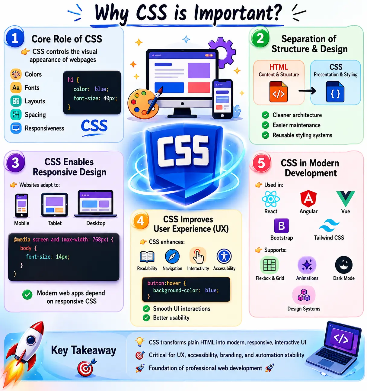
Introduction to the Role of CSS
When browsers render a webpage, they initially interpret HTML as structured content. HTML alone provides semantic meaning and document structure, but it does not define how content should visually appear. CSS introduces presentation rules that control layout, spacing, typography, positioning, colors, responsiveness, animations, transitions, and overall visual behavior.
Without CSS:
- Websites would look plain and unstructured
- Navigation would become difficult
- Responsive behavior would not exist
- Accessibility would suffer
- User engagement would decline dramatically
Modern users expect applications to behave consistently across devices, support dark mode, respond smoothly to interactions, and adapt dynamically to different screen sizes. CSS is the technology responsible for enabling these expectations.
Separating Content from Presentation
One of the most important architectural roles of CSS is the separation of content from presentation. HTML defines what the content is, while CSS defines how it should appear.
For example:
<h1>SoftwareTips4U</h1>
Without CSS, the heading appears using browser defaults. With CSS:
h1 {
    color: blue;
    font-size: 40px;
}
the same HTML becomes visually styled and professionally presented.
This separation provides major engineering advantages:
- Cleaner code structure
- Easier maintenance
- Reusable styling systems
- Better scalability
- Improved collaboration between teams
Frontend developers can modify appearance without touching HTML structure, while content editors can update content without affecting design.
CSS and Visual Design
The most visible role of CSS is controlling the visual appearance of webpages. CSS governs virtually every visual aspect users interact with.
CSS controls:
- Colors
- Typography
- Spacing
- Borders
- Shadows
- Backgrounds
- Positioning
- Animations
- Layout structures
- Hover effects
Without CSS, websites resemble unformatted documents. With CSS, they become modern applications with visual hierarchy and engaging user interfaces.
For example, a professional e-commerce platform relies heavily on CSS to create:
- Product grids
- Responsive cards
- Navigation menus
- Promotional banners
- Interactive buttons
CSS transforms static HTML into interactive UI systems.
Building Responsive Websites
One of the most important responsibilities of CSS in modern development is enabling responsive design. Users access websites from mobile phones, tablets, laptops, ultrawide monitors, and smart devices. A webpage must adapt seamlessly across all screen sizes.
CSS provides tools such as:
- Media queries
- Flexible units
- Flexbox
- CSS Grid
- Responsive typography
Example:
@media screen and (max-width: 768px) {
    body {
        font-size: 14px;
    }
}
This allows layouts and typography to adapt automatically based on device width.
Without CSS, responsive design would not exist. Responsive behavior is now a mandatory expectation for modern applications.
CSS and Layout Management
CSS is responsible for arranging and positioning elements on the screen. Modern layout systems have evolved significantly over time.
Historically, developers used:
- Tables
- Floats
These techniques were difficult to maintain and inefficient for responsive layouts.
Modern CSS provides:
Flexbox
Flexbox simplifies one-dimensional layouts.
display: flex;
Common uses:
- Navigation bars
- Aligning items
- Responsive rows
CSS Grid
CSS Grid enables complex two-dimensional layouts.
display: grid;
Common uses:
- Dashboards
- Product grids
- Responsive page structures
These modern systems dramatically improved frontend architecture and layout consistency.
Improving User Experience (UX)
CSS directly impacts user experience. A website may have powerful backend functionality, but poor visual design can make it unusable.
CSS improves UX through:
- Readable typography
- Visual hierarchy
- Interactive feedback
- Smooth transitions
- Consistent spacing
- Hover effects
Example:
button:hover {
    background-color: blue;
}
This simple effect provides visual feedback that improves interaction clarity.
Good CSS design enhances:
- Navigation
- Readability
- User engagement
- Interaction quality
Poor CSS creates frustration and reduces usability.
Supporting Accessibility
Accessibility is a critical part of modern development, and CSS contributes heavily to making applications usable for all users.
CSS supports accessibility through:
- Proper color contrast
- Focus indicators
- Scalable typography
- Responsive layouts
Example:
input:focus {
    outline: 2px solid blue;
}
This helps keyboard users identify focused elements.
Accessibility-focused CSS improves usability for:
- Visually impaired users
- Keyboard-only users
- Mobile users
- Users with cognitive challenges
Modern Agile teams increasingly treat accessibility as a mandatory engineering concern.
CSS and Performance Optimization
CSS affects frontend performance and browser rendering efficiency.
Well-structured CSS improves:
- Rendering speed
- Maintainability
- Load performance
Best practices include:
- External stylesheets
- Browser caching
- Reduced duplication
- Optimized selectors
Example:
<link rel="stylesheet" href="style.css">
External CSS files allow browsers to cache styles, improving subsequent page loads.
Poorly structured CSS can increase rendering cost and slow down applications.
Branding and Design Consistency
Large applications rely on CSS for maintaining consistent branding across the entire platform.
CSS controls:
- Brand colors
- Typography systems
- Component styling
- Themes
- Spacing standards
Example:
:root {
    --primary-color: #005eff;
}
This enables centralized design systems where colors and themes remain consistent throughout the application.
Enterprise applications depend heavily on CSS architecture for UI consistency.
CSS in Modern UI Development
Modern web applications are impossible without CSS. Applications such as:
- Banking systems
- SaaS platforms
- Admin dashboards
- Social media applications
- E-commerce systems
all rely on CSS for:
- Responsive layouts
- Component styling
- Interactive behavior
- Dark mode support
- Animation systems
Even highly JavaScript-driven frameworks ultimately render HTML styled by CSS.
CSS and Reusability
CSS enables reusable design systems through classes and component-based styling.
Example:
.btn {
    padding: 10px;
    border-radius: 5px;
}
Reusable CSS classes:
- Reduce duplicate code
- Improve maintainability
- Speed up development
This principle becomes essential in large enterprise applications.
CSS Animations and Interactions
CSS supports modern interactive behavior without requiring JavaScript.
Example:
.box {
    transition: 0.3s;
}
CSS animations are used for:
- Hover transitions
- Loading effects
- Interactive feedback
- Smooth UI changes
Modern interfaces rely heavily on subtle motion and transitions to improve usability.
CSS Architecture in Large Applications
Enterprise-scale applications often contain:
- Thousands of components
- Multiple development teams
- Shared design systems
Without proper CSS architecture, maintainability becomes impossible.
Common architectural approaches include:
- BEM (Block Element Modifier)
- Utility-first CSS
- CSS Modules
- Component-scoped styling
Well-structured CSS architecture reduces technical debt and prevents style conflicts.
CSS in Frontend Frameworks
Modern frontend frameworks still fundamentally depend on CSS.
Examples include:
- Bootstrap
- Tailwind CSS
- Material UI
- Chakra UI
Even frameworks like React, Angular, and Vue ultimately rely on CSS to render styled interfaces. JSX and templates may abstract HTML, but browsers still process CSS for visual presentation.
CSS and Browser Rendering
CSS is deeply integrated with browser rendering engines. Browsers follow a rendering pipeline:
- HTML → DOM
- CSS → CSSOM
- DOM + CSSOM → Render Tree
- Layout calculation
- Painting
CSS directly affects:
- Rendering performance
- Reflows
- Repaints
- GPU compositing
Poor CSS can slow rendering and create performance bottlenecks.
CSS in Agile Development
In Agile workflows, CSS plays an active role throughout the sprint lifecycle.
During development:
- Developers create component styles
- Designers define design systems
- QA engineers validate layouts
- SDETs inspect DOM structure
CSS impacts:
- UI consistency
- Responsive behavior
- Automation locator stability
Modern teams treat CSS as a critical engineering concern, not just visual decoration.
CSS and Test Automation
CSS significantly affects automation stability.
Automation tools rely on:
- Stable DOM structures
- Predictable layouts
- Reliable element visibility
Poor CSS can create:
- Hidden elements
- Dynamic positioning issues
- Flaky automation tests
Well-structured CSS improves Selenium and Playwright reliability.
Common Problems CSS Solves
CSS solves many critical UI challenges:
- Poor layouts
- Inconsistent spacing
- Device compatibility issues
- Visual inconsistency
- Unreadable typography
- Non-responsive designs
Without CSS, modern web applications would become unusable.
Limitations of CSS
Despite its power, CSS has limitations.
CSS cannot directly handle:
- Business logic
- Complex computation
- Application state management
CSS also introduces challenges such as:
- Specificity conflicts
- Cross-browser inconsistencies
- Large-scale maintainability issues
Modern tooling and architecture patterns help mitigate these problems.
Best Practices for CSS
Professional frontend teams follow strong CSS engineering practices.
Recommended practices include:
- Use external stylesheets
- Prefer reusable classes
- Follow naming conventions
- Build responsive layouts
- Use Flexbox and Grid
- Avoid excessive nesting
- Minimize !important usage
- Write scalable, maintainable CSS
Good CSS engineering is essential for long-term project health.
CSS as Part of the Frontend Architecture
In a production application, CSS is part of the architecture rather than a finishing layer added after functionality. Layout decisions affect component boundaries, source order, reusable markup, loading behavior, and interaction states. A team that postpones styling until the end often discovers that the HTML structure cannot support responsive behavior, accessible focus order, or realistic content without substantial rework.
CSS also defines contracts between components and their containers. A component should know its internal spacing and states, while the surrounding layout should control placement and available width. When components assume a fixed page position or reach into unrelated descendants, reuse becomes difficult. Clear ownership reduces accidental coupling between teams.
Modern architecture often combines a small global foundation with component styles and utilities. Global rules establish box sizing, typography, colors, and document behavior. Components own their internal presentation, while utilities handle deliberate one-purpose adjustments. The exact method varies, but predictable boundaries are more important than the name of the methodology.
Creating Visual Hierarchy and Readability
CSS helps users understand a page before they read every word. Heading scale, spacing, contrast, alignment, grouping, and emphasis communicate which information is primary, which elements belong together, and which actions are available. This visual hierarchy reduces cognitive load and makes complex interfaces easier to scan.
Typography is central to that work. Font family, size, weight, line height, measure, and paragraph spacing affect reading speed and comprehension. Extremely long lines are difficult to track, while narrow columns create disruptive wrapping. Responsive typography should remain readable under zoom and user font settings rather than relying on fixed pixel dimensions.
Spacing performs a structural role as well as an aesthetic one. Consistent spacing tokens distinguish relationships: elements inside a component may sit closer together than separate sections. Random margins can make identical relationships appear different. A systematic scale gives designers and developers a shared visual language.
Responsive Design Beyond Device Width
CSS enables an interface to adapt not only to phones and desktops but also to split-screen windows, browser zoom, embedded panels, orientation changes, and components reused in different containers. Flexbox, Grid, intrinsic sizing, wrapping, min-content behavior, media queries, and container queries provide a responsive system without measuring every element through JavaScript.
A resilient layout starts with content. Navigation must accommodate longer labels, cards must expand for descriptions, forms must support validation messages, and tables need a strategy for narrow spaces. Breakpoints should be introduced when content no longer fits comfortably rather than selected only from a list of popular devices.
Mobile-first CSS usually starts with a simple single-column experience and adds layout complexity as space becomes available. It does not mean that desktop is less important. It means the base style remains usable under constrained conditions, which often produces cleaner source order and fewer overrides.
Supporting Interaction States
Applications communicate state visually through CSS. Buttons, links, inputs, tabs, menus, dialogs, and selected items need recognizable default, hover, focus, active, disabled, loading, error, and success states. Consistent treatment helps users predict behavior and recognize the result of an action.
Hover alone cannot carry essential information because touch devices and keyboard users may never trigger it. Focus styles need sufficient contrast and should not be removed simply because a browser outline conflicts with a visual design. Disabled styling should be paired with correct HTML behavior or application state; lowering opacity does not actually disable a control.
Transitions can make state changes easier to follow, but motion should be brief, purposeful, and optional where appropriate. CSS media features such as prefers-reduced-motion let applications reduce or remove nonessential animation for users who request it. Feedback should remain understandable when animation is unavailable.
CSS in Design Systems
A design system turns recurring visual and interaction decisions into shared foundations and components. CSS expresses tokens for color, typography, spacing, radius, borders, elevation, motion, and responsive behavior. Components then apply those tokens to buttons, fields, alerts, navigation, tables, dialogs, and other patterns.
Custom properties make many tokens available at runtime. A brand or theme can redefine a controlled set of values without duplicating every component rule. However, a token should represent a meaningful design decision, not merely rename every raw number. Semantic names such as surface, text-muted, or danger-border communicate intended use better than names tied only to a color value.
Design systems improve consistency and delivery speed, but they also need governance. Components require accessibility review, responsive examples, state documentation, versioning, and deprecation plans. CSS is the implementation layer that converts the design language into behavior across products.
The Role of CSS in Accessibility
Accessible HTML can be made difficult to use by poor CSS, while thoughtful CSS can support a wide range of users. Adequate contrast, readable text, visible focus, sufficient target sizes, logical source order, and layouts that survive zoom are essential. Content should not disappear or overlap when text size increases.
CSS must not make color the only indicator of validation, selection, or status. Icons, text, shape, or other cues should reinforce meaning. Visual reordering through Grid or Flexbox should be used carefully because screen readers and keyboard navigation normally follow DOM order, not the rearranged visual order.
Techniques for hiding content have different effects. display: none and the hidden attribute generally remove content from visual and accessibility presentation, while a carefully implemented visually hidden class keeps text available to assistive technology. The correct choice depends on whether the content should remain perceivable to nonvisual users.
CSS, Performance, and Core User Experience
CSS participates in the critical rendering path. The browser needs style information to construct the render tree and determine layout. Large blocking stylesheets, unused framework code, expensive fonts, and late-loading CSS can delay meaningful rendering or cause a flash of unstyled content.
Layout stability also depends on CSS. Reserving dimensions or aspect ratios for images, advertisements, embeds, and dynamic regions prevents surrounding content from shifting after load. Stable components improve user experience and support metrics related to visual stability. Responsive images and font-loading choices also influence rendering and perceived speed.
During interaction, changes to some properties trigger layout and paint, while transform and opacity can often be composited more efficiently. This does not mean every animation must use the same properties, but high-frequency animation should be measured with browser performance tools. Optimization decisions should be based on evidence from realistic devices.
CSS and Search Experience
Search engines primarily depend on content, semantics, links, metadata, and technical accessibility, but CSS affects whether that content provides a good user experience. Layout stability, mobile usability, readable text, and responsive controls influence how visitors engage with a page. CSS that hides primary content, creates intrusive overlays, or produces unusable mobile layouts can undermine otherwise strong content.
Presentation should preserve semantic source order and meaningful headings. A visually large line is not automatically an HTML heading, and CSS should not be used to make unrelated markup imitate semantic structure. Similarly, hiding duplicate keyword blocks off-screen is not a legitimate styling technique and can create accessibility and search-quality problems.
Print styles can also extend content usefulness. Documentation, invoices, reports, and tutorials may need navigation removed, links clarified, colors adjusted, and page breaks controlled for print or PDF output. CSS allows one semantic document to serve screen and print contexts without duplicating the content.
Cross-Browser and Cross-Device Reliability
CSS standards are widely supported, but applications still encounter differences in form controls, fonts, scrolling, mobile viewport behavior, new layout features, and operating-system conventions. Teams need a defined support policy and representative testing rather than assuming identical rendering everywhere.
Progressive enhancement provides a dependable baseline and adds newer capabilities when available. Feature queries can conditionally apply supported rules. Build tools can add necessary prefixes based on the browser target, but they cannot decide whether a layout remains usable when a feature is absent.
Testing should include real supported browsers, keyboard and touch input, portrait and landscape orientation, zoom, high pixel density, and realistic content. Browser developer tools help simulate conditions, but selected physical-device checks remain valuable for viewport, keyboard, and performance behavior.
CSS and Internationalization
Global applications must handle languages with longer words, different line-breaking rules, right-to-left direction, and varied font metrics. Fixed widths and hardcoded heights often fail when labels expand. Flexible sizing, wrapping, logical properties, and content-driven layout allow components to adapt without separate CSS for every translation.
Logical properties such as inline and block margins describe relationships according to writing direction rather than assuming left and right. Direction-aware icons and alignment may still require deliberate handling. Fonts must contain the required glyphs and maintain readable line height across scripts.
Localization testing should use real translations or deliberately expanded pseudo-localized text. It should also check numbers, currencies, dates, form errors, buttons, tables, and dialogs. CSS plays a major role in whether internationalized content remains usable.
Theme and Dark Mode Support
Theme systems illustrate CSS's role in application state and branding. Custom properties can represent semantic colors such as background, surface, primary text, muted text, border, accent, success, warning, and danger. A theme changes those tokens while components continue to reference the same meanings.
Dark mode is not created by inverting every color. Contrast, elevation, images, shadows, disabled states, focus indicators, charts, and code blocks need deliberate review. The prefers-color-scheme media feature can honor an operating-system preference, while an application setting may override it and persist the user's choice.
Theme testing should cover every component state and ensure that meaning does not rely on colors that become indistinguishable. Centralized tokens make corrections safer than searching through hundreds of literal color values.
CSS in Component-Based Development
React, Angular, Vue, Web Components, and server-rendered component systems all produce browser elements that CSS must present. Component-based styling may use global classes, CSS Modules, scoped styles, utility classes, CSS-in-JS, shadow DOM, or a combination. Each approach trades off isolation, reuse, runtime cost, tooling, and ease of override.
A good component exposes appropriate variants and states without requiring consumers to depend on its private markup. Containers determine external layout while the component controls internal appearance. This separation makes refactoring safer and helps teams reuse components in pages, dialogs, sidebars, and responsive grids.
Components should be reviewed with long content, missing optional content, errors, loading states, reduced motion, and different themes. Visual snapshots can detect unexpected changes, but they should complement semantic, interaction, and accessibility tests.
Collaboration Between Design, Development, and QA
CSS sits at the intersection of design intent and browser behavior. Designers define hierarchy, states, responsive expectations, and tokens. Developers translate those decisions into reusable rules and components. QA engineers validate visual consistency, accessibility, responsive behavior, browser support, and interaction states.
Collaboration works best when specifications include more than a static desktop image. Teams need content behavior, minimum and maximum sizes, breakpoints, empty and error states, keyboard focus, loading, motion, and dark-mode expectations. Early discussion reduces late fixes and prevents CSS from becoming a collection of emergency overrides.
Shared browser reproductions and component stories make defects easier to discuss. A report should identify viewport, browser, zoom, content, state, expected behavior, actual behavior, and evidence. Precise CSS defect reporting helps developers reproduce the condition instead of interpreting subjective descriptions such as "the page looks wrong."
Maintaining CSS Over Time
CSS tends to grow because adding a rule feels safer than removing an old one. Over time, unused selectors, duplicated values, specificity escalation, and undocumented exceptions make changes risky. Ownership, code review, linting, visual regression checks, and periodic deletion keep the stylesheet understandable.
Refactoring should be incremental. Identify a component boundary, add tests or visual examples, simplify selectors, replace repeated values with meaningful tokens, and verify supported states. Large rewrites can reintroduce years of edge cases if existing behavior is not understood.
Metrics such as stylesheet size or unused declarations can guide investigation, but maintainability cannot be reduced to a number. Clear names, predictable cascade, limited responsibilities, good documentation, and easy deletion are stronger signs of healthy CSS architecture.
Real-World Example: E-Commerce Checkout
An e-commerce checkout demonstrates how many roles CSS performs at once. Grid or flex layouts arrange cart details and payment forms. Typography and spacing establish hierarchy. Responsive rules move from multiple columns to a focused mobile flow. Form styles communicate required fields, focus, validation errors, disabled actions, and processing states.
Accessibility rules preserve visible focus, contrast, zoom, and readable errors. Design tokens maintain brand colors and spacing across product, cart, and order confirmation pages. Reserved space prevents totals, payment widgets, or promotional messages from shifting the purchase button during loading.
Automation also depends on predictable visibility and stable states. Performance depends on critical styles, fonts, and layout stability. Printing may require a simplified receipt. This single workflow shows why CSS is part of product engineering, quality, and conversion rather than merely decoration.
Production CSS Review Workflow
A production review begins with structure and ownership. Confirm that the HTML remains semantic, component boundaries are clear, and selectors do not depend unnecessarily on deep DOM nesting. Check whether the change reuses existing tokens and components or introduces another variation of an established pattern. New global rules deserve particular scrutiny because their effects can extend far beyond the page under review.
Next, test content variation. Replace short sample text with long headings, translated labels, validation messages, empty states, large numbers, and missing optional data. Resize the container continuously rather than checking only named breakpoints. Verify that text wraps, controls remain reachable, media retains an appropriate aspect ratio, and dynamic content does not overlap adjacent sections.
Accessibility review should include keyboard navigation, visible focus, color contrast, text zoom, reduced motion, high-contrast preferences where supported, and reading order. Confirm that CSS has not hidden meaningful labels, reordered content confusingly, or made a native control difficult to recognize. Test error, disabled, selected, loading, and success states rather than only the default appearance.
Performance review examines added stylesheet weight, fonts, images, animation frequency, layout shifts, and costly runtime changes. Use browser tools to inspect rendering and network behavior on representative hardware. A minor visual effect may not justify a large dependency or repeated layout work. At the same time, avoid micro-optimizations that make component ownership and maintenance unclear without measurable benefit.
Finally, test supported browsers and collect evidence through screenshots, visual regression, accessibility checks, and focused interaction tests. Document intentional deviations from the design system and remove temporary overrides. This workflow makes CSS review an engineering quality activity with observable acceptance criteria rather than a subjective final glance.
Practical Checklist
- Keep content structure semantic and presentation responsibilities clearly separated.
- Use flexible layout systems and constraints that survive realistic content.
- Provide responsive behavior for containers, zoom, orientation, and narrow screens.
- Define complete interaction states, including keyboard focus and errors.
- Apply accessible contrast, sizing, motion, source order, and visibility techniques.
- Reuse design tokens and components instead of duplicating visual decisions.
- Test supported browsers, themes, languages, loading states, and dynamic updates.
- Measure rendering and delivery performance before introducing complex optimizations.
- Keep selectors predictable and remove obsolete rules when components change.
- Review CSS with design, development, QA, and accessibility perspectives.
Interview Perspective
A concise answer:
CSS is responsible for styling, layout, responsiveness, and user experience in web development.
A stronger real-world answer:
CSS separates presentation from structure and enables responsive layouts, accessibility, branding consistency, animations, and maintainable UI systems in modern web applications.
Interviewers often expect understanding of:
- Responsive design
- Flexbox/Grid
- CSS architecture
- Performance impact
- Accessibility
Key Takeaway
CSS is the technology that makes the modern web usable, responsive, attractive, and interactive. Its role extends far beyond visual styling and directly impacts performance, accessibility, maintainability, branding, testing, and user engagement.
Without CSS:
- Modern UI would not exist
- Responsive design would fail
- User experience would degrade
- Web applications would become difficult to use
One-Line Insight
👉 HTML gives structure to the web—CSS gives it life.