Evolution of CSS (CSS1 → CSS2 → CSS2.1 → CSS3 → Modern CSS)
Introduction
The modern web would be unimaginable without CSS. Every visually appealing website, responsive application, interactive dashboard, e-commerce platform, and mobile-friendly interface relies heavily on Cascading Style Sheets (CSS). While HTML provides the structure of a web page and JavaScript adds interactivity, CSS is responsible for presentation, layout, responsiveness, visual hierarchy, animations, and overall user experience.
Today, developers can build sophisticated user interfaces using technologies such as Flexbox, Grid, Variables, Container Queries, Dark Mode, Animations, and Design Systems. However, CSS did not begin with these advanced capabilities. It evolved gradually over nearly three decades, transforming from a simple styling language into a powerful UI engineering technology. Understanding this evolution helps developers appreciate modern CSS, understand legacy codebases, make better architectural decisions, and become more effective frontend engineers.
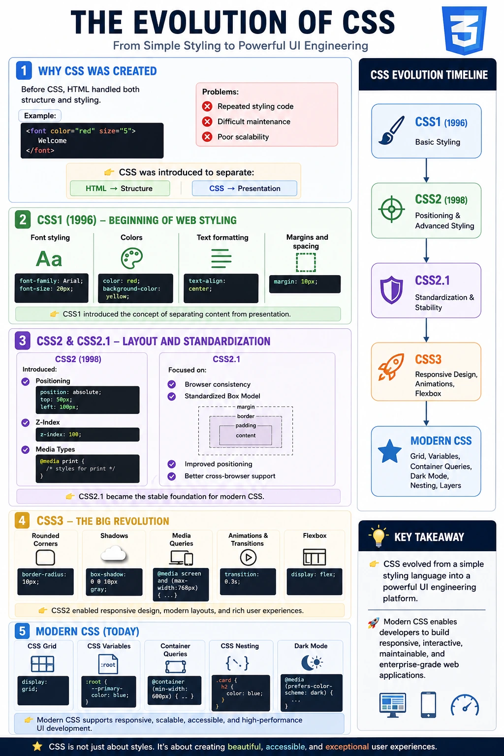
The journey of CSS can be divided into several major stages:
CSS1 (1996)
    ↓
CSS2 (1998)
    ↓
CSS2.1 (2004–2011)
    ↓
CSS3 (2011+)
    ↓
Modern CSS
Each stage introduced important innovations that shaped the web development practices we use today.
Why CSS Was Created
To understand the evolution of CSS, it is important to understand why it was created in the first place.
In the early days of the web, HTML was responsible for both content and presentation. Developers used HTML tags not only to structure content but also to control colors, fonts, alignment, and spacing.
For example:
<font color="red" size="5">
Welcome
</font>
Although this approach worked for small websites, it quickly became problematic as websites grew larger.
Several issues emerged:
- Excessive code duplication
- Poor maintainability
- Difficulty updating designs
- Mixing content with presentation
- Limited design flexibility
- Inconsistent styling
Imagine updating the font color across hundreds of pages. Developers had to manually modify numerous HTML files. This process was time-consuming, error-prone, and difficult to maintain.
The web needed a dedicated styling language that would separate structure from presentation. This led to the creation of Cascading Style Sheets (CSS), allowing HTML to focus on content while CSS handled visual design.
CSS1 (1996): The Beginning of Web Styling
CSS Level 1 was officially released by the World Wide Web Consortium (W3C) in December 1996. This was the first standardized version of CSS and represented a revolutionary step toward separating content from presentation.
The primary goal of CSS1 was simple:
Separate website structure from website appearance.
Although CSS1 was limited compared to modern standards, it introduced several foundational capabilities.
Font Styling
Developers could control fonts using properties such as:
font-family: Arial;
font-size: 20px;
font-weight: bold;
This eliminated the need for excessive <font> tags.
Text Formatting
CSS1 enabled better control over text appearance.
text-align: center;
line-height: 1.5;
Developers could now manage alignment and readability more effectively.
Colors
One of the most visible improvements was color management.
color: red;
background-color: yellow;
Colors could now be controlled centrally through stylesheets.
Margins and Spacing
CSS1 introduced basic spacing control.
margin: 10px;This helped improve layout consistency.
Simple Selectors
Developers could target HTML elements directly.
h1 {
    color: blue;
}
This significantly reduced repetitive HTML styling.
Limitations of CSS1
Although CSS1 was groundbreaking, it was far from complete.
It lacked support for:
- Positioning systems
- Layout engines
- Media queries
- Responsive design
- Advanced selectors
- Animations
- Complex page structures
As websites became more sophisticated, developers demanded more powerful styling capabilities. CSS1 provided a foundation, but it could not support the growing complexity of the web.
CSS2 (1998): A Major Expansion
CSS Level 2 arrived in 1998 and dramatically expanded the capabilities of CSS.
This release transformed CSS from a simple styling language into a powerful layout and presentation technology.
The web was evolving rapidly. Websites were becoming larger, businesses were moving online, and developers needed greater control over page design.
CSS2 introduced several revolutionary features.
Positioning
One of the most important additions was positioning.
position: absolute;
top: 50px;
left: 100px;
Developers could now place elements precisely on a page.
This enabled:
- Menus
- Popups
- Dashboards
- Custom layouts
Positioning opened entirely new possibilities for web design.
Z-Index
CSS2 introduced layer management.
z-index: 100;Developers could control which elements appeared above or below others.
This became essential for:
- Modals
- Tooltips
- Navigation overlays
- Pop-up windows
Media Types
CSS2 introduced media-specific styling.
@media print {
}
Developers could create separate styles for:
- Screens
- Printers
- Handheld devices
This significantly improved content presentation across different mediums.
Advanced Selectors
CSS2 expanded selector capabilities.
div p {
    color: blue;
}
Developers could target elements more precisely.
This improved:
- Maintainability
- Reusability
- Styling consistency
Generated Content
Pseudo-elements such as:
::before
::after
allowed developers to insert content without modifying HTML.
This capability remains heavily used today.
Impact of CSS2
CSS2 made many previously impossible designs achievable.
Developers could now create:
- More sophisticated layouts
- Print-friendly websites
- Better navigation systems
- Larger enterprise websites
However, CSS2 introduced a major challenge.
Different browsers implemented CSS differently.
Internet Explorer, Netscape, Opera, and Firefox often interpreted CSS rules inconsistently. Developers frequently spent countless hours fixing browser-specific issues.
CSS2.1 (2004–2011): Stability and Standardization
The inconsistent implementation of CSS2 created significant problems.
A page that worked perfectly in one browser could appear broken in another.
To address these issues, CSS2.1 was introduced. Its primary purpose was not to add flashy new features but to improve stability and browser consistency.
Why CSS2.1 Was Needed
Different browser vendors interpreted specifications differently.
Common issues included:
- Inconsistent box models
- Positioning differences
- Margin calculation discrepancies
- Selector behavior inconsistencies
CSS2.1 aimed to eliminate ambiguity and standardize behavior.
Better Box Model Definition
The CSS box model became clearly defined.
Every element consists of:
Content
   ↓
Padding
   ↓
Border
   ↓
Margin
Understanding this model remains essential for modern CSS development.
Improved Positioning
CSS2.1 refined positioning behavior.
Elements behaved more consistently across browsers, reducing cross-browser compatibility issues.
Better Selector Standardization
Selectors became more predictable.
Developers could rely on consistent behavior across different rendering engines.
Why CSS2.1 Remains Important
Many concepts still used daily originated from CSS2.1.
These include:
- Box Model
- Floats
- Positioning
- Margins
- Padding
- Basic layout techniques
Many enterprise applications still contain CSS2.1-era code today. Understanding CSS2.1 remains valuable for maintaining legacy systems.
CSS3 (2011+): A Revolutionary Transformation
CSS3 represented one of the biggest transformations in web development history.
Unlike previous versions, CSS3 was not released as a single specification.
Instead, it was divided into independent modules.
Examples include:
- Selectors Module
- Flexbox Module
- Animations Module
- Backgrounds Module
This modular approach allowed features to evolve independently and be adopted faster.
Rounded Corners
Before CSS3, rounded corners required images.
CSS3 introduced:
border-radius: 10px;Developers could now create modern UI designs with a single line of CSS.
Shadows
CSS3 introduced shadows.
Box shadows:
box-shadow: 0 0 10px gray;Text shadows:
text-shadow: 1px 1px 2px black;These effects dramatically improved visual aesthetics.
Gradients
Developers no longer needed images for gradients.
background: linear-gradient(
    blue,
    purple
);
This improved both performance and design flexibility.
Web Fonts
CSS3 introduced custom font support.
@font-faceDevelopers were no longer limited to system fonts.
This transformed branding and typography on the web.
Media Queries and Responsive Design
One of the most influential CSS3 features was media queries.
@media screen and
(max-width:768px)
Media queries enabled responsive web design.
Websites could now adapt to:
- Mobile phones
- Tablets
- Laptops
- Desktop monitors
Responsive design became the industry standard.
Transitions and Animations
CSS3 introduced native animation support.
Transitions:
transition: 0.3s;Animations:
@keyframesDevelopers could create engaging interfaces without JavaScript.
Flexbox
Flexbox revolutionized layout design.
display: flex;Before Flexbox, developers struggled with:
- Floats
- Clearing elements
- Vertical alignment issues
Flexbox solved many of these challenges elegantly.
It remains one of the most important CSS technologies today.
Impact of CSS3
CSS3 transformed the web into a platform capable of delivering:
- Mobile-friendly applications
- Rich user experiences
- Interactive interfaces
- Advanced animations
- Modern design systems
Many developers consider CSS3 the moment CSS became a true UI engineering tool rather than merely a styling language.
Modern CSS: The Current Era
Today's CSS goes far beyond traditional styling.
Modern CSS includes capabilities that once required significant JavaScript or complex workarounds.
CSS Grid
Grid introduced true two-dimensional layouts.
display: grid;Grid excels at:
- Dashboards
- Complex layouts
- Responsive page structures
Unlike Flexbox, which works primarily in one dimension, Grid manages rows and columns simultaneously.
CSS Variables
Modern CSS supports custom properties.
:root {
   --primary-color: blue;
}
Benefits include:
- Centralized design management
- Easy theming
- Improved maintainability
Variables are now fundamental to modern design systems.
Modern CSS Functions
Functions such as:
calc()
min()
max()
clamp()
allow dynamic calculations directly in CSS.
Example:
font-size: clamp(16px, 3vw, 32px);This enables responsive sizing without JavaScript.
Container Queries
Container Queries are among the most important modern CSS innovations.
Traditional responsive design responds to screen size.
Container Queries respond to container size.
@containerThis enables true component-based design.
Components become reusable regardless of where they are placed.
CSS Nesting
Modern CSS now supports nesting.
.card {
    h2 {
        color: blue;
    }
}
Benefits include:
- Reduced repetition
- Cleaner code
- Improved maintainability
CSS Logical Properties
Logical properties improve internationalization support.
Example:
margin-inline-startThis automatically adapts for:
- Left-to-right languages
- Right-to-left languages
Such capabilities are increasingly important in global applications.
CSS Layers
Layers improve cascade management.
@layerBenefits include:
- Better organization
- Reduced specificity conflicts
- Easier maintenance
Dark Mode Support
Modern browsers support native dark mode detection.
@media (prefers-color-scheme: dark)Dark mode has become a standard expectation in modern applications.
Modern Layout Technologies
Today's developers primarily rely on:
display: flex;and
display: grid;Floats, once the dominant layout technique, are now rarely used for layout purposes.
Browser Competition and the Standards Challenge
The history of CSS cannot be separated from browser implementation. A written standard becomes useful only when browsers interpret it consistently. During the early commercial web, vendors competed by introducing proprietary tags, prefixed properties, and rendering behavior. Pages were often designed for one browser and repaired with conditional code or hacks for another.
The box model became a famous source of incompatibility. Browsers disagreed about whether declared width included padding and borders, so identical rules produced different rendered sizes. Developers used document modes, reset stylesheets, parsing tricks, and browser detection to compensate. These techniques kept sites working but increased technical debt and made standards-based design harder.
Standards work, improved test suites, and more frequent browser updates gradually reduced these differences. Modern browsers still vary in defaults and in the timing of new feature support, but the development model has shifted from browser-specific pages toward interoperable standards and progressive enhancement.
From Monolithic Levels to Living Modules
The familiar labels CSS1, CSS2, and CSS3 are useful historical summaries, but modern CSS no longer advances as one single version delivered all at once. CSS3 split the language into modules such as selectors, backgrounds and borders, colors, media queries, animations, transforms, and flexible box layout. Each module could mature at its own pace.
This approach reflects the size of the platform. A stable color module does not need to wait for an experimental layout feature, and a new selector can progress independently from typography. Modules may have their own levels that extend earlier work. As a result, describing today's platform simply as CSS4 would hide the different maturity and support status of its parts.
Developers should evaluate specific features rather than rely only on a version label. Documentation, browser compatibility data, standards status, and project support policies provide a better basis for adoption. A modern feature may be safe across all supported browsers even though no universal CSS4 release exists.
The Evolution of CSS Layout
Layout history shows why modern CSS feels dramatically different from its predecessors. Early pages used document flow and tables for visual arrangement, even when the content was not tabular. CSS introduced floats for wrapping text around media, but developers adapted them into multicolumn layouts because no purpose-built system was widely available.
Float layouts required clearing techniques, fixed assumptions, and careful source order. Absolute positioning offered precision but removed content from normal flow, making it fragile for dynamic text and responsive pages. Inline-block and table display values solved selected problems but still left vertical alignment, equal-height columns, distribution, and complex responsiveness difficult.
Flexbox introduced a one-dimensional system for alignment and distribution along a main and cross axis. It simplified navigation, toolbars, centered content, wrapping rows, and component internals. Grid then provided a two-dimensional system with explicit rows and columns, track sizing, placement, gaps, and named areas. Together they replaced many layout workarounds with algorithms designed for application interfaces.
The Evolution of Responsive Design
CSS2 media types recognized that one document might need different presentation on screens and printers. Media queries later made conditions more expressive, allowing styles to respond to width, orientation, resolution, user preferences, and other characteristics. This capability helped responsive web design replace separate desktop and mobile sites.
Early responsive work often relied on fixed breakpoints and fluid percentages. Modern CSS adds intrinsic sizing, responsive Grid tracks, aspect ratios, flexible gaps, clamp(), and container queries. Components can now adapt to their own available space instead of assuming the viewport determines every layout decision.
The philosophy also evolved. Device-specific design gave way to content-driven constraints and mobile-first enhancement. A robust component should survive narrow containers, zoom, long labels, translated text, and dynamic content, not merely match screenshots at three common viewport widths.
Typography and Web Fonts
CSS1 provided font families, sizes, weights, styles, line heights, and text formatting, but designers were initially limited to fonts installed on the user's computer. This produced small groups of so-called web-safe fonts and image-based headings when a distinctive typeface was required.
Web font support transformed brand and editorial design. The @font-face rule allowed a site to supply font resources, while later formats and browser support improved delivery. Variable fonts can contain multiple weights, widths, or other axes in one resource, enabling flexible typography with fewer files in appropriate cases.
Greater power introduced performance and accessibility responsibilities. Font loading can delay text or cause layout shifts, and an attractive font can still be unreadable. Modern typography balances branding with fallback stacks, caching, subsets, loading behavior, readable line lengths, scalable units, and user preferences.
Selectors and the Growing Expressiveness of CSS
Early selectors targeted elements, classes, IDs, and basic relationships. Later selector levels added attribute matching, sibling combinators, structural pseudo-classes, form states, and increasingly expressive functions. Developers can target patterns such as the first item, every odd row, an invalid field, or an element containing a particular descendant condition.
This expressiveness can reduce markup and JavaScript, but it should not encourage selectors tied to every detail of the DOM. Stable classes, semantic attributes, and component boundaries remain easier to maintain than long structural chains. Modern selectors are most valuable when they express real states and relationships clearly.
Selector evolution also affects tooling and automation. CSS selector syntax is widely used by browser APIs and test frameworks, but presentation classes are not always stable locator contracts. Test code should distinguish the power of selector syntax from the lifecycle of the attributes it targets.
Transforms, Transitions, and Animation
Before CSS transitions and animations, many visual effects required JavaScript timers, animated image formats, or plugins. Transforms enabled translation, rotation, scaling, and skewing without rewriting document geometry in the same way as traditional positioning. Transitions interpolated values when state changed, and keyframes described multi-stage animation.
These features allowed interaction feedback, menus, loading indicators, and visual continuity to be implemented declaratively. Browsers can often optimize transforms and opacity efficiently, although real performance still depends on the element size, effects, device, and frequency of change.
Modern practice treats motion as communication rather than decoration by default. Animation should clarify relationships or state and should respect reduced-motion preferences. Essential content and functionality must not depend on an effect completing or being visible.
Custom Properties and Runtime Design Tokens
Preprocessors popularized variables before browsers supported them directly. Native custom properties changed the model because they participate in the cascade, inherit, and can be updated at runtime. A component can consume semantic tokens while a container, theme, or user preference supplies different values.
Custom properties support colors, spacing, typography, motion, dimensions, and other reusable decisions. They combine with functions such as calc() and can provide fallbacks. Design systems use them to connect foundations with components and to support branding or dark mode without duplicating every declaration.
They are not compile-time constants, and that distinction matters. Their values are resolved in context and may remain token streams until consumed by a property. This makes them powerful for dynamic systems but requires developers to understand inheritance, invalid values, and fallback behavior.
Preprocessors and the Influence of Tooling
As stylesheets grew, preprocessors such as Sass and Less introduced variables, nesting, mixins, functions, modules, and generated output. They improved organization during a period when native CSS lacked equivalent conveniences and influenced features that later appeared in the platform.
Post-processing tools added vendor prefixes, optimized output, transformed newer syntax, and removed or reorganized styles. Bundlers integrated CSS with component dependency graphs. Linters enforced conventions, while source maps connected generated files to authoring sources.
Modern CSS reduces the need for some preprocessing, but tooling remains valuable. The right question is not whether native CSS or a tool is universally better; it is whether the tool solves an actual project problem without hiding the cascade, increasing runtime cost, or making debugging and upgrades unnecessarily difficult.
Frameworks, Utilities, and Component Styling
CSS frameworks emerged to standardize grids, typography, forms, and common components. Bootstrap accelerated responsive development with shared conventions. Utility-first systems such as Tailwind compose small single-purpose classes, while component libraries combine design systems with framework-specific behavior.
CSS Modules, scoped styles, CSS-in-JS, shadow DOM, and other approaches address style ownership in component applications. Each changes how names, dependencies, themes, and overrides are managed, but none eliminates browser concepts such as inheritance, layout, specificity, or computed values.
The evolution of tooling demonstrates a recurring need: teams want reuse without global conflicts. Developers who understand the underlying platform can evaluate whether a framework's conventions match the product instead of treating abstraction as a replacement for CSS knowledge.
Accessibility Through CSS History
Early visual design often assumed one screen size, one font size, and mouse input. Modern CSS operates in a web with zoom, touch, keyboard navigation, assistive technology, forced colors, dark mode, reduced motion, and varied user preferences. Accessibility therefore influences layout, color, focus, visibility, and animation decisions.
Media features can respond to reduced motion, color schemes, and contrast-related preferences. Relative units and flexible constraints help pages survive text enlargement. Logical properties support different writing directions. These features extend the original goal of presenting one structured document in multiple user contexts.
CSS cannot create semantics that HTML lacks, and visual reordering can conflict with reading order. Its evolution increases the ability to support users, but responsible implementation still requires semantic structure, testing, and deliberate design.
Performance Across CSS Eras
CSS performance concerns have changed with the platform. Early developers reduced image slices and table complexity, while later sites managed large frameworks, web fonts, animation, runtime style injection, and unused component rules. The browser still must obtain styles, calculate matching rules, perform layout, paint, and composite the result.
Modern features can improve performance by replacing images or JavaScript-driven layouts, but they are not automatically free. Large blur effects, excessive layers, layout-triggering animations, and oversized stylesheets can be costly. Delivery, caching, critical rendering, and visual stability matter alongside selector and rendering behavior.
Performance tools make evidence available. Teams can inspect coverage, network timing, style recalculation, layout shifts, paint, and animation frames. Historical rules of thumb should be verified against current browsers and realistic devices rather than followed mechanically.
Progressive Enhancement and Feature Adoption
CSS has always evolved faster than some supported browsers. Progressive enhancement lets a page begin with a robust baseline and add improved presentation when features are available. The cascade itself supports fallbacks: an older understood declaration can precede a newer one, and unsupported declarations are ignored.
Feature queries provide explicit conditional styling, while compatibility data helps teams decide whether a fallback is needed. The decision should consider the project's actual users and support policy, not only global browser percentages. A new feature may be safe for decoration but inappropriate for an essential layout without fallback.
This strategy allows teams to benefit from modern CSS without freezing the codebase at the oldest supported capability or breaking core tasks for a minority of users.
Maintaining and Modernizing Legacy CSS
Legacy stylesheets may contain float grids, clearfixes, vendor hacks, image-based decoration, duplicated values, and high-specificity selectors. Rewriting everything at once can be risky because old rules often encode undocumented browser fixes and content edge cases.
A safer migration starts with an inventory and representative visual tests. Modernize one component or layout boundary at a time, preserve semantic HTML, replace float layout with Flexbox or Grid where appropriate, introduce tokens for repeated decisions, and remove rules only after confirming they are unused.
Modernization should have a product reason: responsiveness, accessibility, maintainability, performance, or removal of unsupported browser code. New syntax alone does not guarantee a better system. The goal is clearer behavior and lower risk.
CSS Evolution Timeline
| Era | Main contribution | Practical impact |
|---|---|---|
| CSS1 | Fonts, colors, text, spacing, basic selectors | Separated common presentation from HTML. |
| CSS2 | Positioning, z-index, media types, richer selectors | Expanded page layout and multiple presentation contexts. |
| CSS2.1 | Clarification and interoperability | Stabilized core box, flow, float, and positioning behavior. |
| CSS3 modules | Media queries, backgrounds, borders, transforms, animation, Flexbox | Enabled responsive and richer application interfaces. |
| Modern CSS | Grid, custom properties, container queries, layers, nesting, logical properties | Supports component-driven, adaptive, maintainable design systems. |
The timeline is a learning aid rather than a strict boundary. Features matured at different times, specifications were revised, and browser support arrived incrementally. Modern development depends on individual feature maturity, not on selecting a single CSS version.
The Direction of Modern CSS
The platform continues moving toward stronger component responsiveness, expressive selection, controlled cascade, better typography, richer color, and fewer reasons to use JavaScript for presentation. Features are designed through standards discussion, experimentation, implementation, interoperability work, and developer feedback.
The lasting direction is not simply more properties. CSS increasingly provides high-level constraints that let browsers solve layout and adaptation while respecting content and user preferences. This reduces procedural work and allows components to function across contexts that authors cannot predict exactly.
Developers should remain curious but disciplined: learn new capabilities, test support, use fallbacks according to risk, and prefer the simplest feature that clearly expresses the design requirement.
Recognizing CSS Eras in Real Code
When reviewing an unfamiliar project, identify the layout model first. Table markup used for visual placement, float-based columns, clearfix utilities, and fixed-width containers usually indicate older constraints. Flex and Grid containers, logical properties, custom properties, and container queries indicate progressively newer approaches, although a mature codebase may combine several eras.
Do not classify old code as incorrect solely because it predates modern features. It may support an older browser policy, preserve a tested print layout, or solve a content case that is not immediately visible. Use browser tools, version history, visual tests, and support requirements to understand the reason before replacing it.
A useful learning exercise is to rebuild the same layout three ways: with floats, with Flexbox, and with Grid. Compare markup requirements, source order, alignment, wrapping, and responsive behavior. The exercise makes historical limitations concrete and shows why newer layout systems reduce work without making foundational box-model knowledge obsolete.
Why Understanding CSS Evolution Matters
Studying CSS history is not merely academic.
It helps developers:
- Understand legacy codebases
- Debug older projects
- Appreciate modern features
- Make better architectural decisions
- Understand browser behavior
- Design scalable UI systems
Many enterprise applications still contain:
- CSS2.1 layouts
- Float-based designs
- Legacy browser compatibility code
A skilled frontend developer understands both modern and historical CSS approaches.
Summary
The evolution of CSS reflects the evolution of the web itself. What began in 1996 as a simple styling language for fonts and colors has grown into a sophisticated UI engineering platform capable of powering complex web applications.
The journey can be summarized as:
CSS1
↓
Basic Styling

CSS2
↓
Positioning & Advanced Styling

CSS2.1
↓
Standardization & Stability

CSS3
↓
Responsive Design, Animations, Flexbox

Modern CSS
↓
Grid, Variables, Container Queries,
Dark Mode, Nesting, Layers
Today, CSS is no longer just a presentation technology. It is a comprehensive system for creating responsive, accessible, maintainable, and high-performance user interfaces. From enterprise applications and e-commerce platforms to mobile-first websites and design systems, modern CSS remains one of the most important technologies in web development.